There is a moment every AI art creator knows: you generate something breathtaking on your screen, stare at it for ten minutes, and then wonder — would this actually look incredible on my wall? The answer, more often than you might expect, is yes. Certain AI art styles translate to physical prints with a depth and presence that screens simply cannot replicate. The texture of brushstrokes on matte paper, the way bold colors absorb light in a living room, the quiet drama of a large-format canvas hanging above a sofa — these are experiences that belong in the real world.
Not every digital image makes a great print, though. Some styles rely on pixel-perfect sharpness that falls flat on paper. Others thrive when translated to museum-quality art paper, gaining a warmth and tactility that elevates them from "cool AI image" to genuine wall art. We have spent countless hours testing which AI art styles hold up under print — which ones make guests stop mid-conversation and ask, "Wait, where did you get that?" This guide covers ten of our favorites: styles that are not only beautiful to generate, but genuinely inspiring when hung in your home, office, or studio. If you are new to the creative process itself, start with our guide on how to create AI art — then come back here to choose the aesthetic that fits your space.
How to Choose the Right AI Art Style for Your Space
Before you generate a single image, pause and look at the room you are decorating. The best AI art styles are not the ones trending on social media — they are the ones that amplify what your space already wants to be. A style that looks stunning in a Pinterest mood board can feel wrong in your actual living room if the scale, palette, or energy does not match the architecture around it. Treat style selection like choosing furniture: you are not just picking something beautiful, you are choosing a visual anchor that everything else will relate to.
Start with four questions. First, what is the room size? Small rooms benefit from styles that create depth without visual noise — impressionist landscapes, soft botanical macros, or mid-century minimalism with generous negative space. Large rooms with high ceilings can handle bold abstracts, cinematic widescreen compositions, and oversized Renaissance portraits that might overwhelm a compact bedroom. Second, what is your existing palette? Pull two or three dominant colors from your sofa, rug, or cabinetry and choose AI art styles that either harmonize with those tones or introduce one deliberate accent color. Third, what mood do you want? Calm and restorative spaces call for soft brushwork and muted palettes; social spaces like kitchens and game rooms can handle pop art energy and saturated graphic color. Fourth, how does the room receive light? North-facing rooms with cool, indirect light suit warm-toned vintage film and golden-hour landscapes; bright south-facing spaces can support high-contrast pop art and vivid anime without feeling harsh.
Match your art to your interior design style: Your walls should feel like a natural extension of your decor philosophy, not a competing statement. Bohemian interiors love Art Nouveau illustration, vintage Polaroid grids, and layered botanical prints. Scandinavian and minimalist spaces thrive on mid-century geometry, tonal abstracts, and restrained impressionist landscapes. Industrial lofts pair beautifully with cinematic photography, bold abstracts, and high-contrast pop art against exposed brick. Maximalist rooms can mix anime portraits, Renaissance drama, and pop art in a curated gallery wall — unified by frame color or a shared accent hue. For room-by-room placement ideas beyond style selection, see our AI art home decor ideas guide.
- Bohemian / eclectic: Art Nouveau, vintage film Polaroids, botanical macros, soft impressionist florals
- Scandinavian / minimalist: mid-century modern geometry, tonal abstract expressionism, muted landscapes
- Industrial / loft: cinematic photography, bold pop art, large-scale abstract color fields
- Traditional / classic: Renaissance portraiture, impressionist landscapes, fine botanical illustration
- Maximalist / creative: anime character art, pop art grids, mixed-style gallery walls with unified frames
- Coastal / relaxed: impressionist seascapes, vintage film beach scenes, soft botanical panels
Start with a journey, not a blank prompt: The fastest path to print-ready AI wall art is choosing a curated creative journey. Pablo AI's journeys guide you through style-specific prompts and settings so your first generation is already optimized for physical printing — no guesswork required.
Classic Art Styles
The masters spent lifetimes perfecting techniques that still move us centuries later. What makes these classic art styles so powerful for AI wall art is that they were originally designed for physical media — canvas, fresco, ink on paper. When you generate impressionist landscapes or Renaissance-inspired portraits with AI and print them on quality stock, you are continuing a tradition that has always been about presence, scale, and the way light plays across a surface. These styles carry inherent authority: guests recognize the visual language even if they cannot name the movement, and that familiarity makes them feel like intentional design choices rather than novelty prints.
1. Impressionist Landscapes
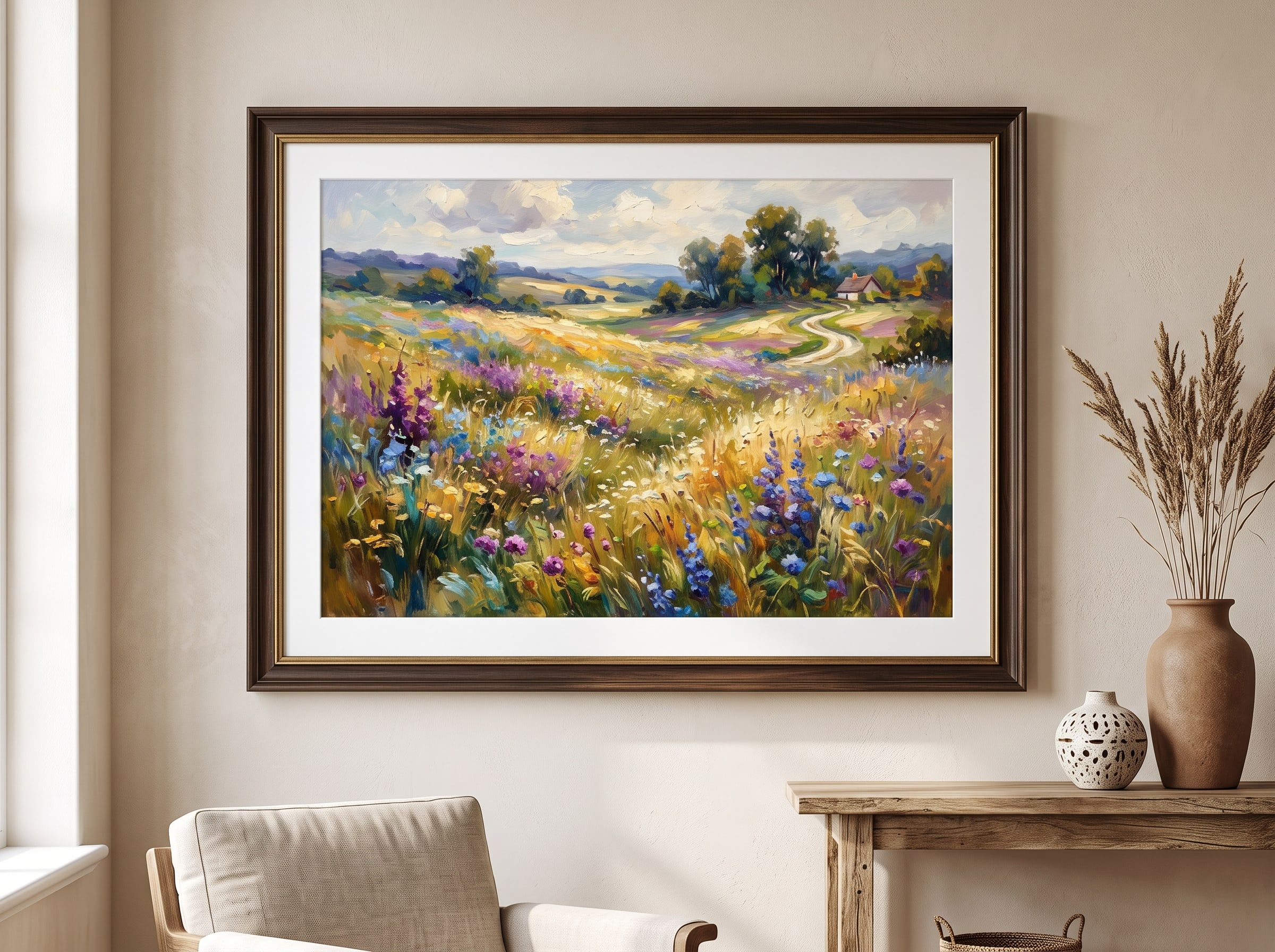
Impressionism is, in many ways, the perfect marriage of AI generation and physical printing. The style's signature broken brushstrokes, soft color transitions, and atmospheric light translate beautifully to textured art paper, where the subtle grain of the stock echoes the organic quality of oil on canvas. Think Monet's water lilies reinterpreted as a misty harbor at dawn, or a field of wildflowers rendered in dappled afternoon light — these are images that invite you to step closer, then step back, then closer again. The lack of hard edges means impressionist AI art forgives the slight softening that happens when digital color moves to paper, often gaining warmth in the translation rather than losing fidelity.
Impressionist AI art styles work exceptionally well in bedrooms, reading nooks, and dining rooms where you want calm without coldness. A large horizontal print above a headboard creates a window-like sense of depth in smaller spaces. In open-plan living areas, pair a warm impressionist landscape with neutral furniture and let the painting supply all the color the room needs. The style also excels in transitional spaces — hallways and stair landings — where a landscape creates a visual journey through the home. Pablo AI's Famous Artists journey includes impressionist presets that emphasize visible brushwork and natural light — the two qualities that matter most when your image becomes a real print rather than a backlit screen.
When generating impressionist landscapes for print, lean into atmospheric subjects: fog over water, golden-hour fields, tree-lined paths with dappled shadow. Avoid overly detailed foreground elements that can muddy at large scale. A horizontal 24×36 or 30×40 print above a sofa or dining table gives the brushwork room to breathe and creates the immersive, almost meditative quality that makes impressionism endure.
- Best rooms: master bedroom, dining room, reading nook, hallway
- Ideal pairings: linen upholstery, natural wood, cream and sage palettes
- Prompt suggestion: "misty impressionist landscape, visible brushstrokes, golden hour light, soft blues and warm golds, atmospheric depth"
- Print tip: matte fine art paper preserves brushstroke texture without glare
2. Renaissance-Inspired Portraiture
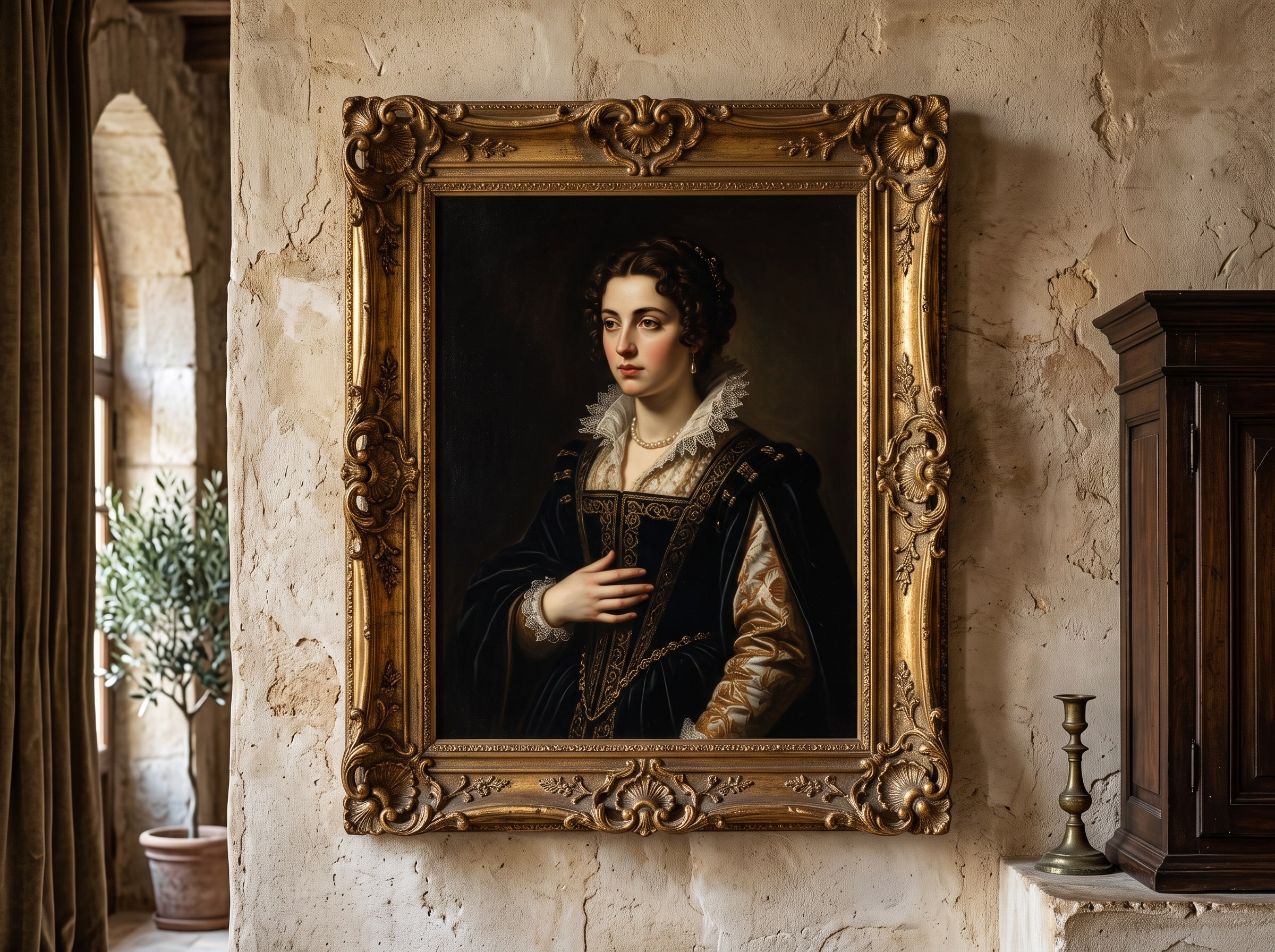
There is something deeply satisfying about a portrait that looks like it belongs in a Florentine palazzo — rich chiaroscuro, luminous skin tones, fabric rendered with almost tactile weight. Renaissance-inspired AI art carries an inherent gravitas that makes it ideal for statement pieces: a single large portrait above a fireplace, a pair of complementary portraits flanking a hallway mirror, or an intimate bust-length study in a home office. These are not casual posters; they are conversation pieces that reward sustained attention. The style communicates permanence and taste, which is why it works so well as a single anchor piece rather than part of a busy gallery cluster.
The key to making Renaissance-style AI wall art feel authentic in print is depth. Pablo AI handles this by layering subtle background atmospherics — the soft architectural arches, the darkened corners, the gentle falloff of light — that give portraits a three-dimensional quality on flat paper. This style shines in formal dining rooms, libraries, and entryways where you want to signal taste without trying too hard. For pet lovers, the same techniques produce astonishing AI pet portraits that look like your dog or cat sat for a 16th-century master. Browse the gallery for examples of how these portraits transform once framed.
Renaissance portraiture demands scale to feel regal rather than costume-party. A bust-length portrait needs at least 16×20 inches to preserve facial detail and fabric texture; a three-quarter or full-length figure rewards 24×36 canvas or fine art paper. Dark walnut or gilt frames amplify the old-master atmosphere, while simple black frames keep the focus on the subject's gaze. Generate with warm, directional lighting and muted background architecture — a darkened interior with a hint of column or arch — to avoid the flat, modern look that undermines the style's authority.
- Best rooms: dining room, entryway, home office, master bedroom
- Ideal format: large single portrait or paired diptych on canvas or fine art paper
- Pablo AI tip: use the Famous Artists journey with "Renaissance portrait" presets for authentic lighting and composition
- Cross-style idea: pair a Renaissance pet portrait with impressionist landscapes in matching frames for a classic-meets-personal gallery wall
3. Art Nouveau Illustration
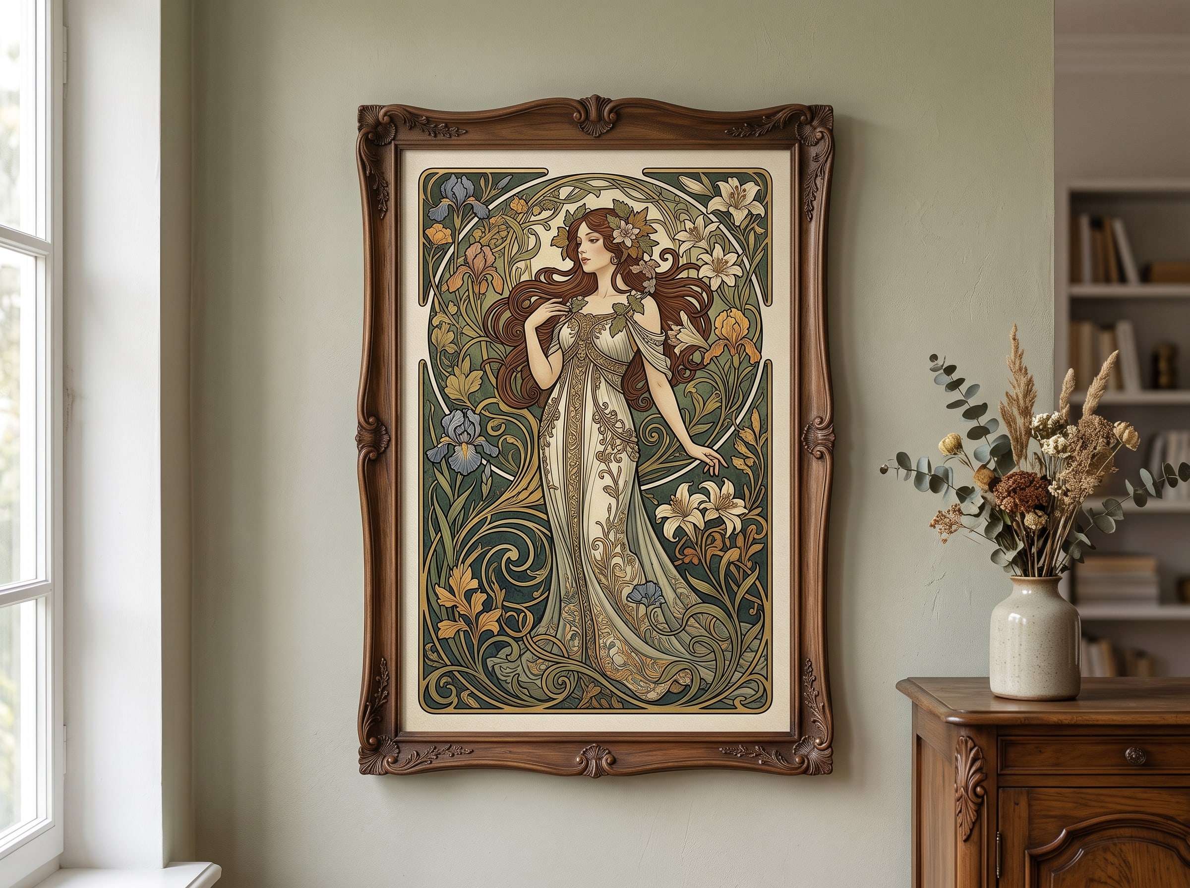
Art Nouveau was born to be decorative. Its flowing organic lines, botanical motifs, and elegant typography were designed to adorn walls, book covers, and architectural details — which means AI-generated Art Nouveau illustrations naturally excel as physical prints. Picture sinuous vine borders framing a central figure, peacock feathers unfurling in gold and teal, or a stylized portrait encircled by lily stems. These images have a jewel-like quality that makes them feel handcrafted even at poster scale. The style's vertical compositions and ornamental borders give even simple subjects — a single figure, a floral study — the presence of a finished design object.
Art Nouveau AI posters work beautifully in bathrooms, powder rooms, and bedrooms where you want romance and detail without visual clutter. The style's vertical compositions suit narrow wall spaces — the gap between windows, the wall beside a wardrobe, the space above a vanity. Because Art Nouveau relies on crisp linework and flat color areas rather than photorealistic gradients, it prints with exceptional clarity even at smaller sizes. The limited palette typical of the movement — deep teals, golds, muted roses, cream — makes it easy to coordinate with tile, wallpaper, and fixture finishes in intimate spaces.
Pablo AI's art print journey includes decorative illustration modes that prioritize clean edges and balanced compositions, ensuring your generated piece looks as intentional on paper as a vintage Mucha poster pulled from an antique shop. For maximum impact, generate in portrait orientation at 11×14 or 18×24 and choose a thin gold or black frame that echoes the style's graphic borders. Art Nouveau pairs especially well with bohemian and vintage-inspired interiors where layered texture and organic forms already dominate the decor.
Prompt for Art Nouveau prints: Try: "Art Nouveau illustration, flowing organic borders, botanical motifs, elegant female figure, gold and teal palette, flat color areas, decorative poster composition, Alphonse Mucha inspired." Keep backgrounds simple so linework stays crisp at print scale.
Art is not what you see, but what you make others see. — Edgar Degas
Modern & Digital Styles
Modern AI art styles embrace boldness — graphic shapes, saturated palettes, cultural references, and experimental compositions that feel unmistakably contemporary. These are the AI posters you hang when you want energy, personality, and a clear point of view. The best part? Modern and digital art styles often look even more striking in print than on screen, because physical media tames the harshness of digital color and gives bold graphics a satisfying material presence. Where classic styles whisper, modern styles speak clearly — and that directness is exactly what makes them work in rooms where life happens loudly: cooking, gaming, creating, gathering.
4. Pop Art & Bold Graphic Posters
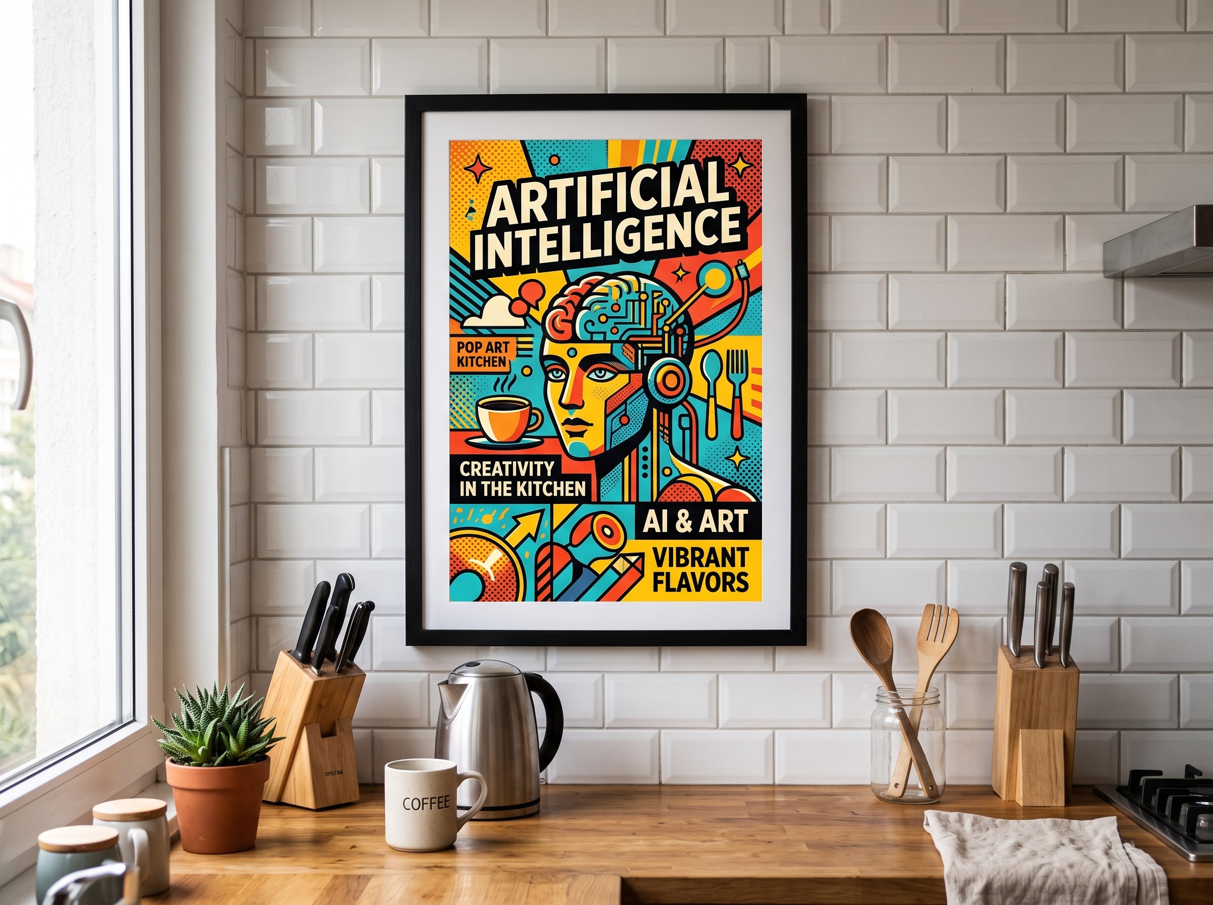
Pop art was the original art movement that blurred the line between high culture and everyday life — and AI-generated pop art carries that same democratic, playful spirit. Bold outlines, Ben-Day dots, high-contrast color blocking, and witty recontextualization of familiar subjects all translate to stunning wall art. A vibrant pop art portrait of your pet, a retro comic-panel interpretation of your city skyline, or a Warhol-esque multiplication of a favorite object — these are AI posters that demand attention and refuse to be ignored. The style celebrates the ordinary as iconic, which makes it deeply personal when the subject is something you actually love.
Pop art AI wall art thrives in kitchens, home bars, game rooms, and teen bedrooms — anywhere you want personality over pretension. The style's flat colors and strong graphic shapes print flawlessly, making it one of the most forgiving art print styles for first-time creators. Scale up to 24×36 inches and let a single bold piece anchor an entire wall. Because pop art relies on contrast rather than subtle gradation, it survives the shift from screen to print better than almost any other style — what you see in generation is very close to what you get on paper.
Pablo AI's art print journey includes pop art and graphic poster presets that optimize contrast and color saturation specifically for physical output, so your prints pop (pun intended) under real-world lighting rather than looking washed out. Consider a grid of four related pop art pieces — same subject, different colorways — for a Warhol-inspired installation above a console or bar cart. Simple white or black frames keep the focus on color; avoid ornate molding that competes with the graphic energy.
- Best rooms: kitchen, home bar, game room, teen bedroom, laundry room
- Ideal sizes: 18×24 statement piece or 12×12 grid of four color variants
- Prompt suggestion: "pop art portrait, bold outlines, Ben-Day dots, high contrast, saturated primary colors, comic book halftone, Warhol inspired"
- Pair with: open shelving, stainless appliances, mid-century bar carts, industrial pendant lighting
5. Mid-Century Modern Minimalism
There is a reason mid-century modern aesthetics have dominated interior design for decades: clean geometry, restrained palettes, and a balance of warmth and sophistication that never feels dated. AI-generated mid-century art — abstract shapes floating on muted backgrounds, stylized botanical forms, geometric landscapes in mustard and teal — brings that same timeless quality to your walls without the vintage-store hunt. These pieces whisper rather than shout, making them ideal for spaces where you want art that complements rather than competes. The style's reliance on negative space means each shape carries weight; there is nowhere for weak composition to hide.
Mid-century modern AI art styles work best in living rooms, home offices, and Scandinavian-inspired interiors where clean lines and negative space are part of the design language. A triptych of three related geometric pieces above a credenza creates a curated gallery effect without the gallery price tag. Because this style relies on precise shapes and smooth color fields, printing on premium art paper with a matte finish preserves the subtle color relationships that define the aesthetic. Pablo AI handles mid-century styles through composition-aware generation that respects negative space — critical when a print's power comes from what is left out, not just what is included.
The mid-century palette is your secret weapon for cohesive rooms: mustard yellow, teal, burnt orange, olive green, and warm gray backgrounds appear repeatedly in authentic period design. Generate a series of three pieces sharing two accent colors but varying the geometric subject — circles, arches, asymmetric blobs — and hang them with equal spacing above furniture. This approach feels designer-curated because the color story unifies the arrangement even when the shapes differ. Avoid glossy paper, which can introduce reflections that flatten the intentional flatness of the style.
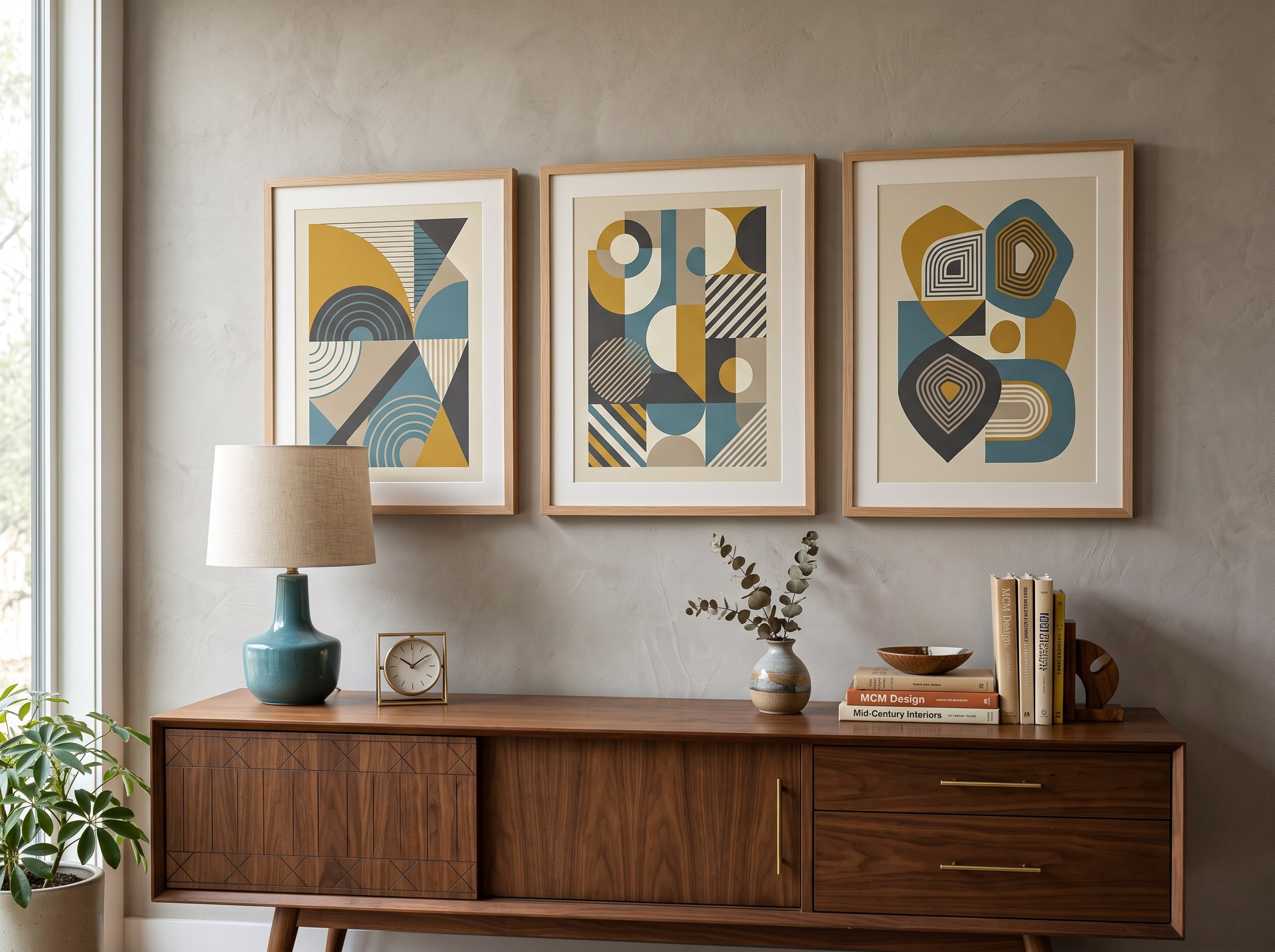
Why matte paper matters for modern styles: Glossy prints can create unwanted reflections that flatten geometric art styles. For mid-century modern, abstract, and minimalist AI wall art, matte or semi-matte art paper preserves the flat, gallery-like presentation these styles depend on.
6. Abstract Expressionism
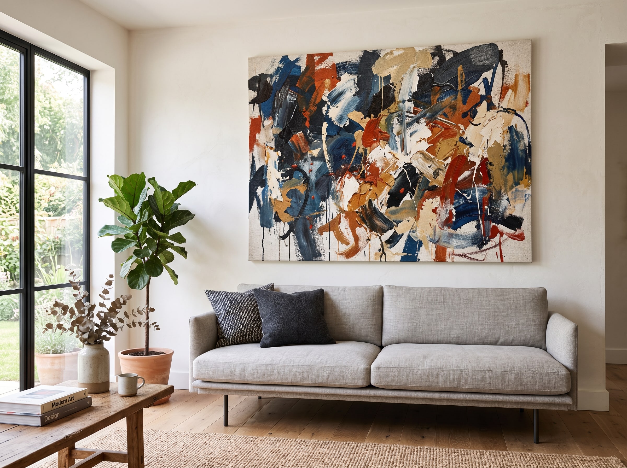
Abstract expressionism is pure emotion rendered as color, gesture, and form. Pollock's energetic drips, Rothko's meditative color fields, de Kooning's turbulent brushwork — these approaches translate to AI with surprising authenticity, producing large-scale abstract pieces that feel spontaneous and deeply personal. As physical prints, abstract expressionist AI art has a commanding presence: it does not depict anything recognizable, so the viewer's entire experience is about mood, color, and the physical act of mark-making frozen in time. There is no narrative to decode, only feeling — which makes abstracts one of the most versatile styles for rooms with strong existing decor.
This is the style for spaces that need a focal point without a literal subject. A massive color-field print above a minimalist sofa. A dynamic action-painting-style piece in a creative studio. A subdued, tonal abstract in a meditation space. Abstract expressionist AI art styles scale beautifully — the larger the print, the more immersive the experience — and they pair well with both warm and cool interior palettes depending on your chosen color story. Unlike figurative art, an abstract can be regenerated in complementary tones until it perfectly matches your rug or throw pillows.
Pablo AI generates abstracts with attention to edge variation and color layering, ensuring that what looks like a spontaneous gesture on screen retains its energy and depth when translated to canvas or fine art paper. For Rothko-inspired color fields, choose canvas wraps at 30×40 or larger — the scale is essential to the meditative effect. For gestural action-painting styles, fine art paper with visible texture adds authenticity. Hang abstracts at eye level when seated if the piece anchors a living room; center them slightly above furniture for maximum impact.
- Best rooms: living room, creative studio, meditation space, modern entryway
- Ideal sizes: 30×40 canvas or larger for color fields; 24×36 for gestural work
- Prompt suggestion: "abstract expressionist color field, layered warm tones, soft edges, meditative atmosphere, Rothko inspired" or "dynamic action painting, bold gestural strokes, high energy, Pollock inspired"
- Pair with: minimalist furniture, neutral walls, natural light — let the art supply all visual complexity
Explore Creative Journeys — Pablo AI's curated journeys guide you through each of these styles step by step — from first prompt to print-ready masterpiece. No art degree required.
7. Anime & Manga Illustration
Anime and manga art styles represent one of the most passionate corners of the AI art community — and for good reason. The combination of expressive characters, dynamic compositions, vibrant color palettes, and emotional storytelling produces images that fans want to live with, not just scroll past. When printed as high-quality AI posters or framed prints, anime-style AI art transforms a bedroom, gaming setup, or creative workspace into a personal sanctuary that reflects genuine enthusiasm rather than generic decor. This is art that says something specific about who you are, which is increasingly rare in mass-produced wall decor.
What makes anime AI wall art work in print is the style's inherent clarity: clean linework, deliberate color choices, and compositional balance that reads well at any size. A dramatic character portrait in chiaroscuro lighting, a serene landscape in the style of a Ghibli background, or an action-packed scene frozen at peak intensity — each makes a different kind of statement on your wall. Portrait-oriented character art at 11×14 or 18×24 preserves facial detail and hair rendering; landscape scene compositions suit wider formats above a desk or gaming setup.
Pablo AI's dedicated anime journey understands the nuances of anime aesthetics — eye rendering, hair detail, background atmosphere — and optimizes generations for the sharp, vivid output that anime fans expect from physical prints. Check the gallery to see how these pieces look framed and hung. For a cohesive room, choose one sub-style and commit: soft watercolor anime for calm bedrooms, bold shonen action for energetic game rooms, or Studio Ghibli-inspired backgrounds for a nostalgic, peaceful atmosphere. Mixing sub-styles on one wall works only when unified by frame color or a shared palette.
- Best rooms: bedroom, gaming room, home studio, dorm room
- Ideal format: portrait-oriented prints (11×14 or 18×24) for character art; landscape for scene compositions
- Pablo AI tip: the anime journey includes style variants from soft watercolor anime to bold shonen action — match the mood to your space
- Related reading: combine anime character art with pop art color energy for a bold teen or studio gallery wall

Photography-Inspired Styles
Some of the most convincing AI wall art styles mimic the language of photography — not because you are trying to fool anyone, but because photographic aesthetics carry a sense of captured reality and intimate moment that painting styles cannot replicate. Cinematic widescreen compositions, the warm grain of vintage film, the hyper-detailed clarity of botanical macro — these photography-inspired AI art styles produce prints that feel like windows into another world. They ground a room in a sense of place and time, even when the place never existed and the moment was synthesized from a prompt.
8. Cinematic Photography
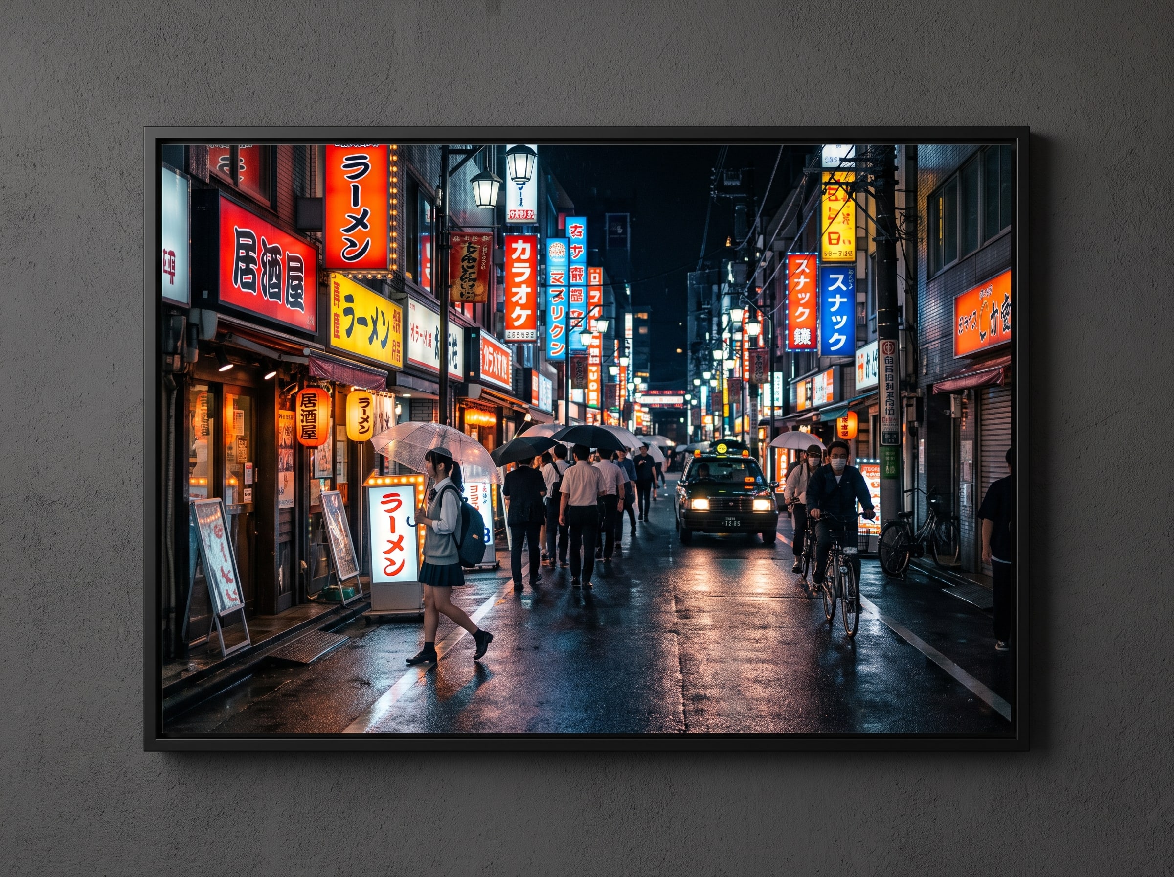
Cinematic AI art styles borrow from the visual language of film — anamorphic widescreen ratios, dramatic color grading, shallow depth of field, and that indefinable quality of a still frame pulled from a movie you wish existed. A neon-lit street scene in rain, a lone figure on a cliff at golden hour, an intimate interior bathed in warm tungsten light — these images carry narrative weight that makes them irresistible as wall art. You do not just see them; you feel the story behind them. The widescreen format naturally suits the horizontal spaces above sofas, media consoles, and dining sideboards.
Cinematic AI posters work best in living rooms, media rooms, and home theaters where the widescreen format feels natural. Print at 24×36 or larger to preserve the cinematic aspect ratio and let the image dominate the wall like a paused film frame. The style also pairs beautifully with industrial and modern interiors — exposed brick, concrete, dark wood — where the drama of cinematic lighting complements the architecture. Avoid placing cinematic prints in rooms with competing visual complexity; these pieces need breathing room to feel intentional rather than cluttered.
Pablo AI handles cinematic styles through the art print journey with presets that emphasize atmospheric perspective, lens-appropriate depth of field, and film-inspired color grading calibrated for print color spaces rather than sRGB screens. Lustre or semi-gloss paper can enhance the photographic quality for cinematic work, mimicking the subtle sheen of a darkroom print. Generate with explicit aspect ratio language — "anamorphic widescreen," "2.39:1 cinematic framing" — to ensure the composition feels filmic rather than like a cropped snapshot.
Cinematic prompt starter: Try: "cinematic street scene at night, neon reflections on wet pavement, anamorphic widescreen composition, shallow depth of field, moody teal and orange color grading, film still atmosphere." Print at 24×36 minimum for full immersive effect.
9. Vintage Film & Polaroid Aesthetic
Nostalgia is one of the most powerful emotions in art, and vintage film aesthetics tap into it effortlessly. Faded color palettes, soft focus, light leaks, grain, and the distinctive white border of a Polaroid frame — these elements transform ordinary subjects into objects of memory and longing. AI-generated vintage film art styles produce prints that feel like discovered treasures, as if you found a forgotten photograph in a drawer and decided it was too beautiful not to frame. The imperfection is the point: these styles embrace the artifacts of analog photography as aesthetic features, not flaws.
Vintage film AI wall art creates warmth in spaces that might otherwise feel sterile — modern apartments, white-walled offices, minimalist studios. A grid of Polaroid-style prints on a cork board wall adds curated personality without overwhelming the room. Single large-format vintage-style landscapes or portraits work beautifully in bedrooms and reading corners where softness and warmth are the goal. Because the vintage aesthetic intentionally embraces imperfection, this is one of the most forgiving AI art styles for printing — slight color shifts and texture variations only add to the authentic feel.
Pablo AI's generation presets simulate film stock characteristics (Kodachrome warmth, faded Ektachrome blues, high-contrast Tri-X grain) that translate naturally to matte art paper. For a curated Polaroid grid, generate six to nine related images — travel scenes, candid portraits, still-life details — in consistent vintage treatment and arrange in a loose grid with washi tape or thin white frames. The white Polaroid border should be part of the generation, not added in post, so proportions stay authentic at print scale.
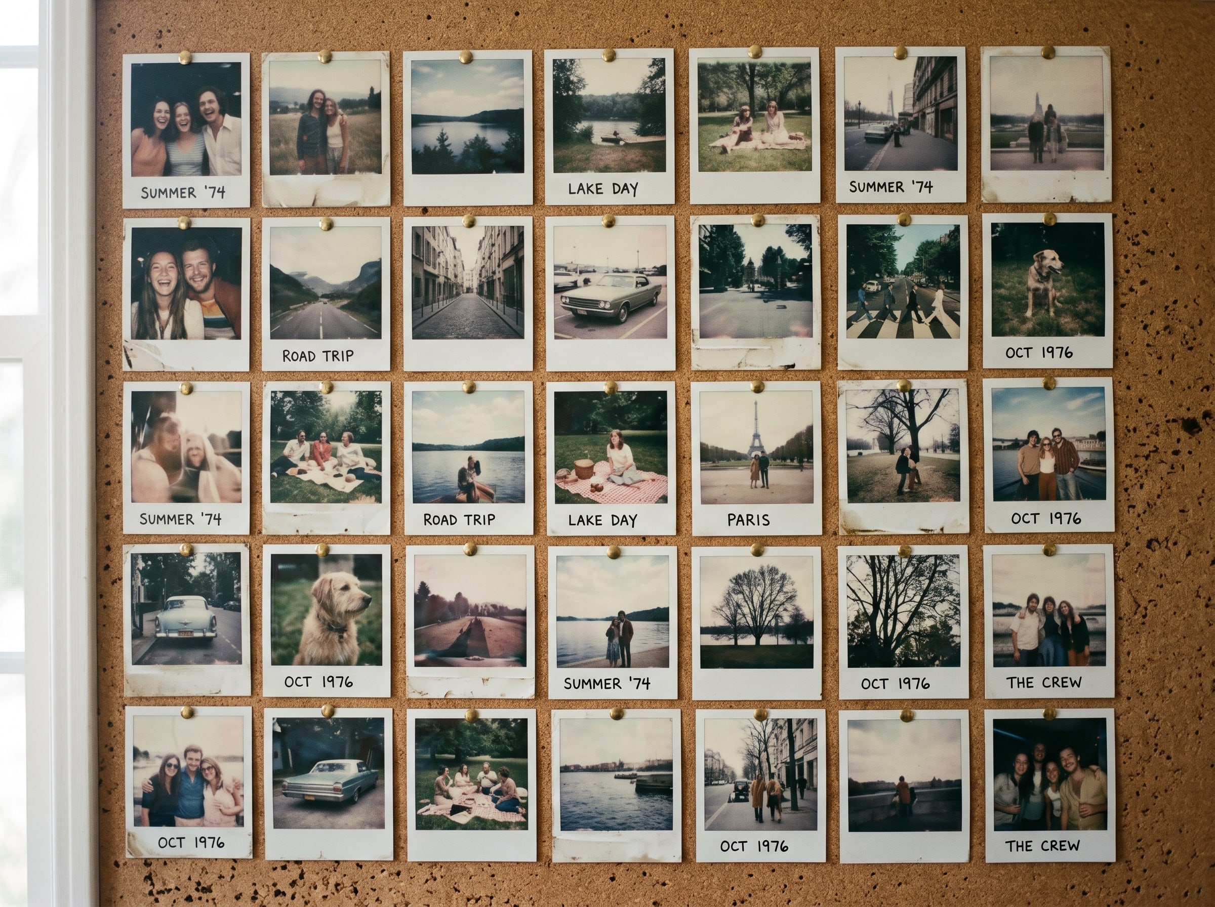
Print vintage styles on matte paper only: Glossy finishes fight against the soft, grainy quality that defines vintage film aesthetics. Always choose matte or fine art paper for Polaroid and retro film AI art styles to preserve their nostalgic character.
10. Botanical & Nature Macro
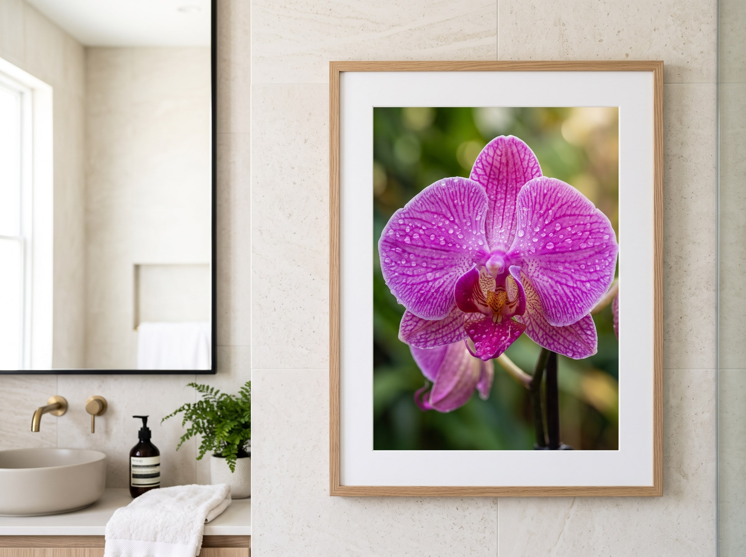
Nature has always been humanity's most universal subject, and AI-generated botanical and macro photography-style art brings the outdoors inside with a level of detail and beauty that real pressed flowers and standard nature photography often cannot match. Luminous orchid petals dewy with moisture, a fern unfurling in hyperdetail, a field of wildflowers rendered with botanical-illustration precision — these images bring life, color, and organic calm to any wall they inhabit. Botanical art crosses cultural and stylistic boundaries: it feels at home in a modern bathroom, a farmhouse kitchen, or a traditional dining room.
Botanical AI art styles are the chameleons of wall decor: they work in virtually every room and every design style. A large macro flower print adds drama to a minimalist bathroom. A botanical grid of four seasonal plants brings rhythm to a kitchen backsplash wall. A serene forest scene creates depth in a narrow hallway. The photography-inspired clarity of these styles means they print with exceptional sharpness and color fidelity on premium art paper, revealing details that reward close inspection — the vein structure of a leaf, the translucency of a petal edge, the dewdrop catching light.
Pablo AI generates botanical art with attention to natural lighting, accurate color relationships, and compositional balance — the three qualities that separate a generic flower image from a print-worthy piece of AI wall art. For bathrooms and kitchens, choose subjects that feel fresh rather than overly romantic: ferns, succulents, herbs, and single-stem studies in soft natural light. A 12×12 grid of four complementary botanicals creates rhythm on a narrow wall; a single 20×30 macro bloom becomes a dramatic focal point above a freestanding tub or dining sideboard.
- Best rooms: bathroom, kitchen, hallway, bedroom, home office
- Ideal sizes: 12×12 grid of four or single 20×30 macro statement piece
- Prompt suggestion: "botanical macro photography, dewy orchid petals, soft natural window light, shallow depth of field, hyperdetailed, clean background"
- Pair with: white tile, natural wood, plants (real or artificial), linen textiles
| Art Style | Best Room | Ideal Print Size |
|---|---|---|
| Impressionist Landscapes | Bedroom, dining room | 24×36 landscape |
| Pop Art & Graphic Posters | Kitchen, game room | 18×24 or 24×36 |
| Anime & Manga | Bedroom, studio | 11×14 or 18×24 portrait |
| Botanical & Nature Macro | Bathroom, kitchen, hallway | 12×12 grid or 20×30 single |
| Abstract Expressionism | Living room, studio | 30×40 or larger canvas |
How to Mix and Match AI Art Styles on One Wall
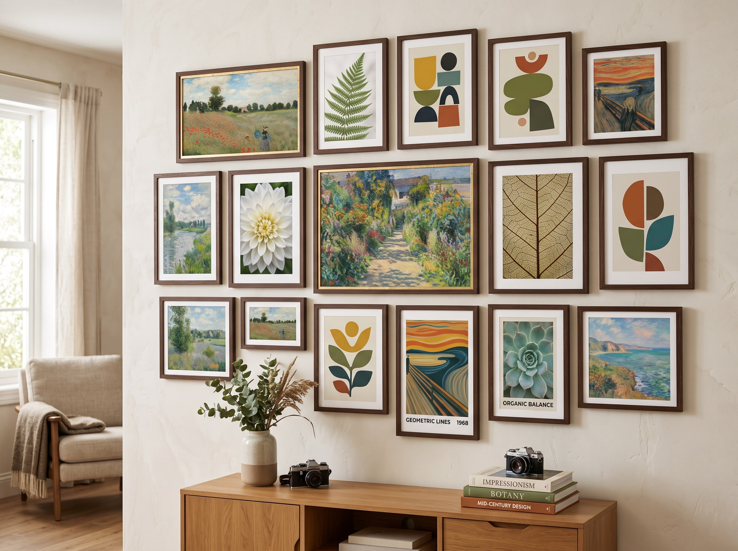
A gallery wall is where AI art truly shines — because you can generate every piece to coordinate without hunting vintage shops for months. But mixing styles requires intention. The most common mistake is treating a gallery wall like a random collection of things you like. The best gallery walls feel curated because something ties the pieces together: frame style, color palette, print size rhythm, or thematic connection. Without that unifying element, even beautiful individual prints can read as chaotic.
The classic-with-modern formula works because contrast creates conversation. Pair a Renaissance-inspired portrait with a mid-century geometric abstract — the centuries between them create tension that feels sophisticated rather than random, especially when both share a warm palette or identical frame molding. Mixing impressionist landscapes with botanical macros succeeds because both draw from nature but interpret it differently: one through painterly atmosphere, one through photographic precision. Pop art and anime coexist naturally when unified by bold saturation and simple black frames; both speak the language of graphic clarity and cultural enthusiasm.
Color unification is your most powerful tool. Choose one accent color — terracotta, sage, navy, mustard — and ensure every piece in the arrangement includes that hue, even if their styles differ wildly. A cinematic teal-and-orange street scene, an abstract with a teal color field, and a botanical with teal-tinted leaves suddenly feel like a collection. Frame selection reinforces the story: uniform thin black frames create a modern gallery look; matching natural wood frames warm up mixed classic styles; identical white mats with varied frame widths add formality to traditional mixes.
- The Classic Salon: one large Renaissance or impressionist anchor (24×36) flanked by four smaller botanical macros (8×10) in matching gold frames — ideal above a dining sideboard or fireplace
- The Modern Grid: six mid-century geometric prints (12×12) in a strict 2×3 grid with thin black frames — perfect for a home office or Scandinavian living room
- The Pop Culture Wall: three pop art pieces (18×24) plus two anime character portraits (11×14) unified by saturated primary colors and white frames — ideal for a game room or teen bedroom
- The Nostalgic Corridor: a horizontal row of eight vintage Polaroid-style prints (5×7 each) with white borders, taped or pinned in a loose line — transforms a narrow hallway into a memory lane
Gallery wall spacing rule: Keep 2–3 inches between framed pieces for a cohesive cluster, or 4–6 inches for a more airy, museum-like presentation. Lay prints on the floor first and photograph the arrangement before committing to nail holes. For more room-specific placement strategies, explore our AI art home decor ideas guide.
Choosing among these AI art styles is not about picking the "best" one — it is about matching the mood, energy, and personality of your space to an aesthetic that amplifies what you already love. A minimalist apartment might come alive with a single bold abstract. A cozy cottage might sing with impressionist landscapes. A creative studio might need nothing more than a wall of anime prints and pop art to feel like yours. The through-line is this: AI art styles are not just digital experiments. With the right style, the right generation approach, and quality printing, they become art you live with.
Ready to turn your favorite style into something you can hang? Start a creative journey, explore what others have created in the gallery, and when you find a piece you love, print it on museum-quality art paper that does your work justice. Your walls are waiting.
Printing Tips for Different AI Art Styles
The style you choose should inform every print decision — paper, size, and finish are not afterthoughts, they are part of the artwork. A glossy pop art print and a matte vintage Polaroid are both "correct," but swapping their paper types would undermine each style's character. Understanding how physical media interacts with different AI art aesthetics is the difference between a print that disappoints and one that makes you reorder three more for other rooms.
Paper choice starts with how the style handles light. Styles built on soft transitions, grain, and atmospheric depth — impressionism, vintage film, watercolor anime — thrive on matte and fine art paper that absorbs light gently and adds tactile warmth. Styles that mimic photography benefit from lustre or semi-gloss finishes that replicate the subtle sheen of darkroom prints without the harsh reflections of full gloss. Bold graphic styles with flat color — pop art, mid-century geometry — work on matte for a gallery-flat presentation or semi-gloss when maximum color vibrancy is the goal. Styles originally painted on canvas — Renaissance portraiture, large abstracts, impressionist landscapes at scale — gain authority from canvas wraps where texture becomes part of the experience.
Sizing follows subject and room, not arbitrary preference. Character-focused styles like anime and Renaissance portraiture need adequate dimensions to preserve facial detail — go too small and the intimacy becomes muddiness. Atmospheric styles like abstracts and impressionist landscapes reward scale: a 30×40 color field transforms a room in ways a 16×20 version cannot. Grid arrangements — Polaroid collections, botanical sets, pop art color variants — work best at uniform small sizes (8×10, 12×12, or 5×7) with consistent spacing. Cinematic widescreen compositions need horizontal real estate; printing cinematic art in portrait orientation defeats the entire aesthetic.
| Style | Recommended Paper | Recommended Size |
|---|---|---|
| Impressionist Landscapes | Matte fine art paper or canvas | 24×36 to 30×40 landscape |
| Renaissance Portraiture | Fine art paper or canvas wrap | 16×20 minimum; 24×36 for statement |
| Art Nouveau Illustration | Matte or semi-matte art paper | 11×14 or 18×24 portrait |
| Pop Art & Graphic Posters | Semi-gloss or matte art paper | 18×24 or 24×36; 12×12 grids |
| Mid-Century Modern | Matte art paper (avoid gloss) | 12×12 triptych or 18×24 single |
| Abstract Expressionism | Canvas wrap or textured fine art paper | 30×40 or larger |
| Anime & Manga | Matte or lustre art paper | 11×14 or 18×24 portrait |
| Cinematic Photography | Lustre or semi-gloss | 24×36 widescreen minimum |
| Vintage Film & Polaroid | Matte fine art paper only | 5×7 to 8×10 grid; 16×20 single |
| Botanical & Nature Macro | Matte or lustre fine art paper | 12×12 grid or 20×30 single |
Color calibration matters: Screens emit light; prints reflect it. Pablo AI's journeys optimize generations for print color spaces, but you should still expect subtle shifts — especially in neon-heavy anime and pop art. Matte paper softens contrast in a flattering way for most styles. When in doubt, generate two variations with slightly different saturation and print the one that felt slightly too bold on screen — it will likely be perfect on paper.
Frequently Asked Questions
Which AI art styles look best as large-format prints?
Abstract expressionism, impressionist landscapes, and cinematic photography styles scale beautifully to 24×36 inches and beyond because they rely on atmosphere, color fields, and compositional depth rather than fine detail that can break down at large sizes. Pop art and mid-century modern styles also excel at poster scale thanks to their bold shapes and flat color areas. For character-focused styles like anime, portrait orientations in the 18×24 range tend to look sharper than oversized prints.
Do AI art styles print differently than they appear on screen?
Yes — and this is why choosing the right art print styles and paper matters. Screens emit light (additive color), while prints reflect light (subtractive color), which means some digital colors shift slightly on paper. Matte art paper softens harsh digital contrast in a good way, while glossy paper can make bold graphic styles pop. Pablo AI's journeys are calibrated with print output in mind, optimizing color saturation and contrast for physical media rather than screen display. Our how to create AI art guide covers the full workflow from generation to print.
Can I mix different AI art styles on the same gallery wall?
Absolutely — some of the most compelling gallery walls mix styles intentionally. A common approach is choosing a unifying element: a consistent frame style, a shared color palette across different art styles, or a uniform print size arranged in a grid. For example, you might combine impressionist landscapes with botanical macros in matching white frames, or create a pop art and anime gallery wall unified by bold, saturated colors. The gallery is a great place to see how different AI art styles coexist in real rooms.
What paper type should I use for AI posters and wall art?
For most AI wall art, matte or semi-matte fine art paper produces the best results — it handles everything from soft impressionist brushwork to sharp anime linework without glare or reflection. Canvas wraps work beautifully for abstract expressionism and large landscape pieces. Glossy paper suits pop art and graphic poster styles where maximum color vibrancy is the goal. Pablo AI offers premium art paper specifically chosen for AI-generated art, ensuring your prints match the quality of the generation.
Which AI art style is best for beginners?
Pop art, mid-century modern, and vintage film styles are the most forgiving for first-time creators because they embrace flat color, intentional imperfection, or graphic simplicity — all qualities that translate reliably to print. Impressionist landscapes are also beginner-friendly because soft brushwork hides minor generation artifacts. Start with a Pablo AI creative journey matched to your room rather than experimenting with blank prompts, and refer to our how to create AI art guide for the full step-by-step process.