If you have ever stared at a blank canvas — digital or physical — and wished someone could help you get past the first stroke, you are exactly who this AI art guide is for. Creating AI art is not about replacing artists. It is about giving yourself a creative partner that responds to your ideas in seconds, lets you explore directions you would never have tried alone, and hands you something tangible you can hang on a wall by the end of the afternoon.
The barrier to entry has never been lower. Modern AI art generators can produce photorealistic portraits, abstract compositions, vintage poster aesthetics, and everything in between. But the gap between "I typed something and got a weird image" and "I made something I actually love" comes down to process — choosing the right tool, understanding how prompts work, and knowing when to iterate instead of starting over. Pablo AI was built around that process. Instead of dumping you in front of a blank text box, it walks you through guided creative journeys where each step narrows your vision until the result feels intentional.
This guide covers the full arc: what AI art actually is, how the technology works at a high level, how to pick the right generator, how to write prompts that produce results you want, how to refine and build collections, and how to turn a digital file into a physical print you will actually hang. Whether you want a single statement piece for your living room or a coordinated gallery wall for a hallway, the workflow is the same — and it starts here.
What Is AI Art and Why Create AI Art Now?
AI art — sometimes called AI generated art or generative art — is artwork created with the help of machine learning models trained on vast collections of images, styles, and visual concepts. You describe what you want (or select options in a guided interface), and the model synthesizes a new image that has never existed before. The output belongs to a moment in time: your prompt, your choices, your refinements.
Why bother? Because speed changes creativity. When generating a new variation takes thirty seconds instead of three hours, you explore more. You try a Caravaggio lighting setup on a portrait of your dog. You test Bauhaus geometry on a landscape you photographed last summer. You discover that your living room actually wants warm abstract tones, not the cool minimalism you assumed. The Pablo AI gallery is full of examples from people who started with a vague idea and ended up with art they framed.
There is also a practical side. Commissioning custom art from a human artist can cost hundreds or thousands of dollars and take weeks. An AI art generator will not replace that relationship when you want a specific artist's hand — but it democratizes experimentation. You can test five different directions for a nursery wall, a home office, or a gift, then invest in a print of the one that landed. That workflow — explore cheaply, commit confidently — is why so many interior designers and homeowners have added AI art to their toolkit.
AI art also fits modern life in ways traditional art-making often does not. You can create a personalized gift at midnight before a birthday. You can generate a series of pieces that match your existing furniture without hiring a designer. You can revisit a concept six months later and produce a companion piece in the same style because your journey settings are preserved. The creative act becomes repeatable and refinable rather than a one-shot gamble.
- No traditional art skills required — you bring taste and intent, the AI handles execution
- Instant iteration lets you compare dozens of directions before committing to one
- Guided journeys remove the guesswork from prompt engineering
- Finished digital files can become museum-quality physical prints in a few clicks
- Collections and series are easy to build when style and mood settings carry across generations
Understanding AI Art Models: What's Happening Under the Hood
You do not need a computer science degree to create beautiful AI art — but understanding the basics of how these systems work will make you a better creator. Most modern AI art generators use a type of model called a diffusion model. The name sounds technical, but the concept is intuitive: imagine starting with a canvas covered in static noise, then gradually refining that noise into a coherent image guided by your text description. The model has learned, from millions of images, what visual patterns correspond to words like "sunset," "watercolor," or "Renaissance portrait." Each generation step removes a little noise and adds a little structure until a finished image emerges.
Text-to-image generation works by translating your prompt into a mathematical representation the model can act on. When you write "misty forest at dawn, quiet and contemplative," the system does not look up a photo of a forest. Instead, it activates learned associations between language and visual features — soft light, desaturated greens, atmospheric haze, vertical tree forms — and steers the denoising process toward combinations that match those associations. The result is synthesis, not retrieval. Every image is newly constructed from learned patterns, which is why two generations from the same prompt can look related but never identical.
Different models produce different results because they were trained on different data, optimized for different goals, and tuned with different aesthetic biases. One model might excel at photorealistic portraits with natural skin tones. Another might prioritize painterly brushwork and dramatic lighting. A third might handle typography and graphic design layouts more reliably. Speed, resolution, and stylistic range also vary. This is why power users on raw platforms spend hours comparing model checkpoints — and why beginners often feel overwhelmed before they generate their first good image.
Pablo AI removes that burden by curating the best models for each creative journey and routing your request to the one most likely to produce excellent results for your specific goal. When you use the Art Print journey, you are not choosing between six different model names you have never heard of — you are selecting a style and a mood, and the platform handles the rest. The Famous Artists journey uses models tuned for painterly aesthetics and period-accurate lighting. Pet Painter prioritizes models that preserve facial structure and fur texture while applying stylization. You focus on creative intent; Pablo AI handles model selection behind the scenes.
You do not need to become a model expert: Raw AI art platforms expect you to know which checkpoint works for anime versus photorealism versus typography. Pablo AI's journeys encode that knowledge into the workflow — style libraries, subject-specific paths, and automatic model routing mean you get strong results without reading model cards or community benchmarks.
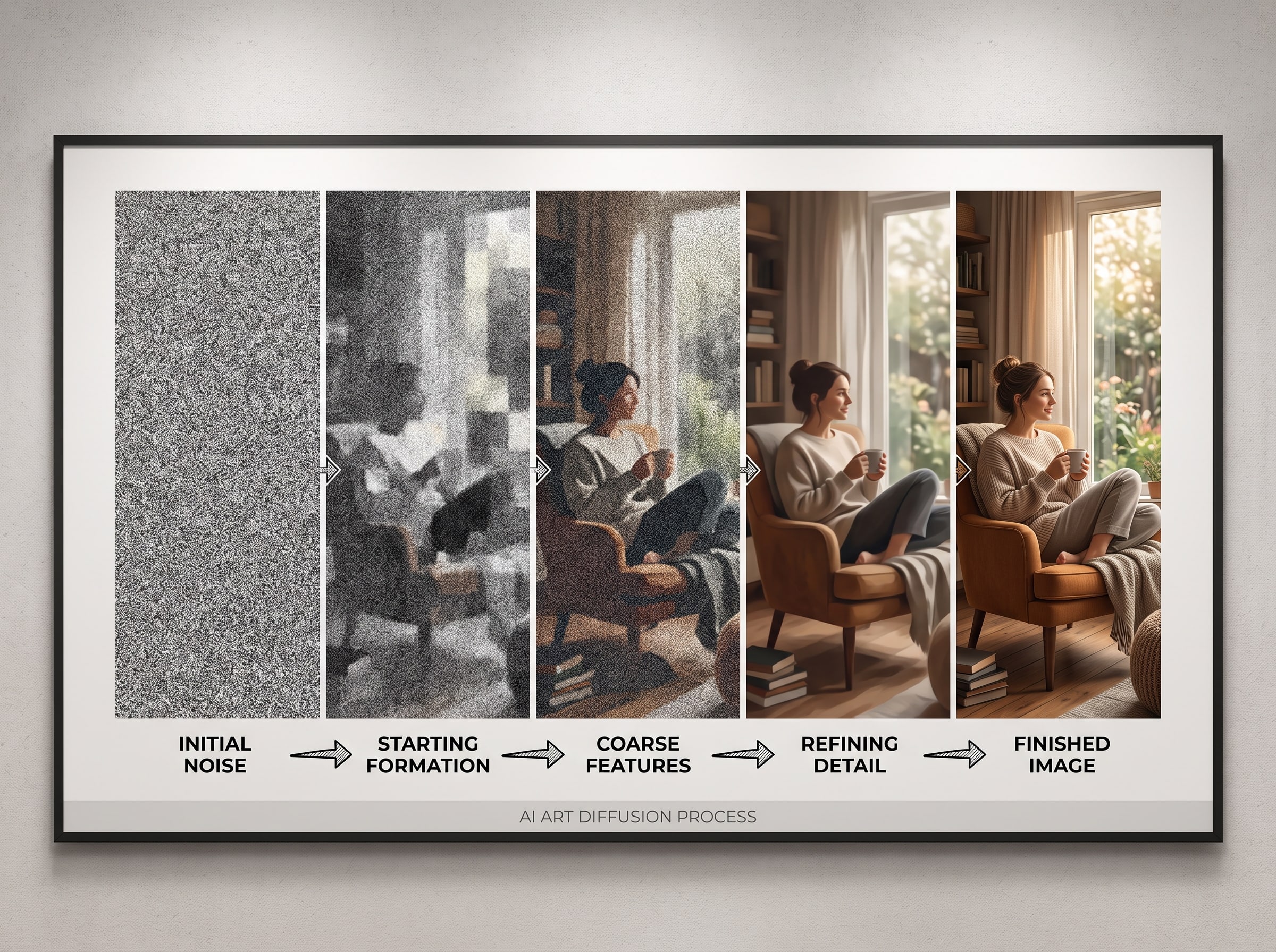
Knowing this helps you iterate smarter. When a result is close but not quite right, you are usually adjusting the steering — your prompt words, your style selection, your subject description — rather than fighting the model itself. When a result is fundamentally wrong in direction, switching journeys or styles often fixes more than prompt tweaking ever will. Treat the model as a skilled collaborator with specific strengths, not a vending machine that either works or does not.
How to Choose the Right AI Art Generator
Not every AI art generator is built the same way, and the differences matter more than raw model benchmarks. Some platforms give you a single text field and wish you luck. Others offer style presets but no structure. Pablo AI takes a third path: curated creative journeys that combine style libraries, subject selection, and AI-assisted prompting so beginners are not left guessing what "cinematic lighting, 8K, trending on ArtStation" even means.
When evaluating an AI art generator, ask yourself three questions. First, does it meet you at your skill level? If you are new, you want guidance — not a Discord server full of prompt recipes. Second, can you iterate without losing your place? Regenerating from scratch every time kills momentum. Third, does the platform connect creation to something real? Digital files are fun; a framed print on your wall is the payoff. Pablo AI handles all three through Pablo Studio journeys and direct paths to ArtPaper prints.
Also consider output quality at print scale. Many generators produce images that look sharp on a phone screen but fall apart at 16×20 inches — soft details, color banding, or compositions that rely on screen brightness rather than ink on paper. Pablo AI optimizes generation for physical output from the start, with aspect ratios and resolution tuned for standard print sizes and color profiles calibrated for ArtPaper. If your end goal is wall art rather than social media content, that pipeline matters more than raw generation speed.
| Feature | Generic AI Tools | Pablo AI |
|---|---|---|
| Getting started | Blank prompt box, steep learning curve | Guided journeys with step-by-step choices |
| Style selection | Describe styles in text or hunt for LoRAs | Visual style picker with 40+ curated art styles |
| Iteration workflow | Manual prompt edits, easy to lose context | In-journey regeneration with preserved settings |
| Physical output | Download PNG and figure out printing yourself | One-click path to premium ArtPaper prints |
| Best for | Power users who enjoy prompt engineering | Anyone who wants to create AI art without the technical overhead |
New to AI art generators?: Start with Pablo AI's Art Print journey — it is the most flexible entry point and exposes you to the full style library without requiring a specific subject like a pet photo or family portrait.
Step-by-Step: How to Create AI Art with Pablo AI
This is the workflow we recommend for every first-time creator. It mirrors what thousands of Pablo AI users follow daily, and it takes roughly ten to fifteen minutes from start to first result. The steps below assume you are starting from scratch, but the same rhythm applies whether you are making a single print or building a multi-piece collection.
Pick a Creative Journey That Matches Your Goal
Head to Pablo Studio and browse the available journeys. Each one is a structured path optimized for a type of creation. Art Print is the general-purpose choice — great for landscapes, abstracts, and conceptual pieces. Pet Painter turns your dog or cat into a Renaissance portrait. Famous Artists places your subject in the style of masters like Van Gogh or Warhol. Family Art transforms group photos into illustrated keepsakes. Pick the journey that closest matches what you have in mind; you can always explore others later.
Each journey shapes the interface to your goal. Pet Painter asks for a photo upload first because likeness matters. Art Print starts with subject and mood because composition matters more than reference accuracy. Famous Artists emphasizes style selection because the aesthetic transformation is the point. Matching journey to intent saves you from fighting the wrong workflow — trying to get a perfect pet likeness through a generic text prompt is frustrating; uploading a photo through Pet Painter is straightforward.
- Open Pablo Studio and select a creative journey
- Upload a reference photo if the journey requires one, or describe your subject in the prompt step
- Browse the visual style library and tap the aesthetic that resonates — do not overthink the first choice
- Review the AI-generated preview and regenerate until one variation feels right
- Save your favorite and continue to product selection or download

Review, Save, and Move Toward Print
Once you have a generation you like, resist the urge to immediately order a print. Save it, step away for a few minutes, and look at it again with fresh eyes. Check the composition at thumbnail size — strong wall art reads clearly even when small. If it still holds up, continue to products and explore sizing options. If something feels off, regenerate once or twice more before committing. The cost of an extra generation is negligible; the cost of a print you do not love is not.
Choosing the Right Aspect Ratio for Your Art
Aspect ratio is one of the most overlooked decisions in AI art creation, and one of the hardest to fix after the fact. The ratio of width to height determines how your subject is framed, how much negative space surrounds it, and which print sizes and wall placements are available without awkward cropping. Choosing the right ratio before you generate saves you from falling in love with an image that cannot fit the frame or wall space you had in mind.
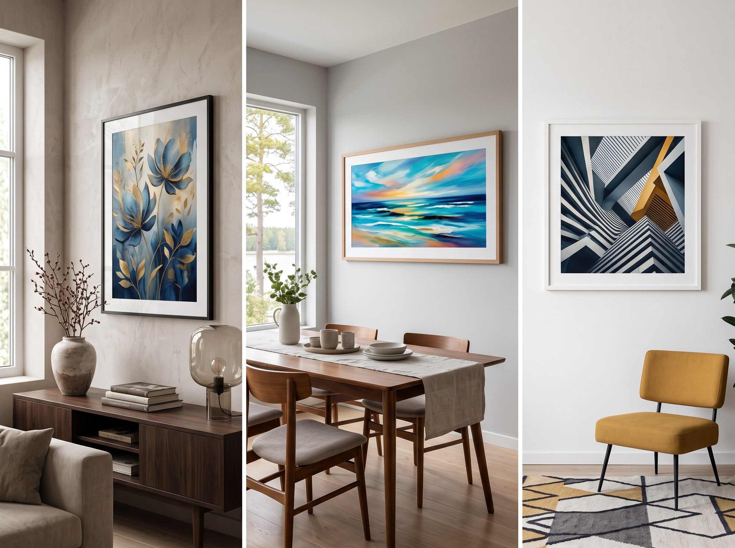
Portrait orientation — taller than it is wide — suits single subjects with vertical emphasis: standing figures, full-length pet portraits, architectural facades, trees, and narrow wall spaces like the gap beside a door or between windows. Landscape orientation — wider than it is tall — excels at horizons, cityscapes, group scenes, and the space above sofas or sideboards where horizontal mass anchors a room. Square formats offer balance and symmetry, making them ideal for social-style compositions, abstract color fields, and grid-based gallery walls where uniform sizing creates visual rhythm.
Aspect ratio also affects composition in ways the model respects during generation. A portrait canvas encourages vertical leading lines and stacked elements — sky above, subject below, foreground anchoring the base. A landscape canvas spreads the eye horizontally, favoring panoramic depth and side-to-side balance. Square canvases center the subject and equalize visual weight on all sides. When you generate at the wrong ratio and crop later, you often lose the intentional framing the model created — lopping off a shoulder, cutting a horizon line, or squeezing a composition that was designed to breathe.
For print planning, match ratio to product early. Standard ArtPaper sizes exist in common ratios — 8×10 and 16×20 are portrait-friendly, 12×18 and 24×36 lean landscape, 12×12 and 20×20 are square. If you know you want a large horizontal piece above your bed, generate in landscape from the start through the Art Print journey. If you are building a vertical gallery column in a hallway, portrait ratios keep each piece consistent. Browse the gallery to see how other creators matched ratio to room placement.
| Aspect Ratio | Best For | Ideal Rooms & Products |
|---|---|---|
| Portrait (2:3, 4:5) | Single figures, pet portraits, tall botanicals, narrow compositions | Hallways, flanking a mirror, beside doorways, 8×10 and 16×20 ArtPaper prints |
| Landscape (3:2, 16:9) | Horizons, panoramas, group scenes, wide abstracts | Above sofas, over sideboards, office walls, 12×18 and 24×36 prints |
| Square (1:1) | Balanced abstracts, centered portraits, grid gallery walls, social-style crops | Kitchen nooks, bathroom walls, Instagram-to-print workflows, 12×12 and 20×20 formats |
| Custom / Wide (2:1+) | Cinematic scenes, ultra-wide landscapes, shelf-length panoramas | Above long consoles, open-plan living rooms, custom framing via products |
Decide your wall before you decide your prompt: Measure the wall space, note whether it is portrait or landscape territory, then choose your aspect ratio in the journey before generating. A prompt that produces a stunning square image is no help if your wall above the sofa demands a horizontal panorama.
Writing Prompts That Produce Better AI Generated Art
Even with guided journeys handling most of the heavy lifting, the words you add still shape the outcome. Think of a prompt as a creative brief, not a magic spell. The best prompts are specific about subject, mood, and context — but leave room for the model to interpret. Over-specifying every leaf and shadow produces rigid, lifeless results. Under-specifying produces generic stock-photo energy. The sweet spot is three to five clear anchors the model can build around.
Start with the subject: who or what is in the image? Then add setting: where are they? Then mood: what should the viewer feel? A prompt like "golden retriever sitting on a porch at sunset, warm and nostalgic" gives the model three clear anchors. Compare that to "dog picture nice" and you can see why specificity matters. Pablo AI's journeys pre-fill much of this structure, so your job is often refinement rather than invention — adding the details only you know, like the specific atmosphere of your backyard or the emotional tone you want a gift to carry.
Layer your prompt in order of importance. Lead with the subject because models weight early words heavily. Follow with setting and time of day, which establish lighting and palette. Close with mood and atmosphere, which influence color temperature, contrast, and emotional register. Avoid burying the subject at the end of a long list of technical instructions. "Cinematic, 8K, hyperdetailed, trending, a cat on a windowsill" puts the cat at risk of being lost in noise. "Cat on a rainy windowsill, cozy and quiet, soft afternoon light" keeps the subject in charge.
- Be specific about subject, setting, and mood — vague prompts produce vague results
- Describe what you want, not what you want to avoid (say "soft watercolor edges" instead of "no harsh lines")
- Use one clear idea per generation; stack changes across iterations instead of one overloaded prompt
- Let the journey's style selection do the heavy stylistic lifting — your text should complement it, not duplicate it
- When regenerating, change one variable at a time so you know what moved the result
- Lead with subject, then setting, then mood — early words carry the most weight
- Avoid keyword stuffing — three clear anchors beat twelve generic modifiers
The power of mood words: If your result looks technically correct but emotionally flat, add a feeling word — "melancholy," "joyful," "quiet," "electric," "wistful," "grounded." Models respond strongly to emotional language even when they cannot literally feel anything. Mood words influence color temperature, contrast, facial expression, and environmental atmosphere simultaneously. One well-chosen feeling can transform a competent image into one that stops you mid-scroll. Try pairing opposites for tension: "serene chaos," "warm isolation," "playful formality."
Prompt Examples That Work Well in an AI Art Generator
Context changes everything. A prompt that works for abstract wall art will fail for a pet portrait. Here are starting points that pair well with Pablo AI journeys — adapt the subject to yours.
For the Art Print journey, try: "misty forest path at dawn, quiet and contemplative, soft green and gold tones" for a calming bedroom piece. "Geometric sunset over desert mesas, bold and graphic, warm orange and deep purple" for a statement living room print. "Abstract flowing shapes in sage and terracotta, calm and organic, minimal focal point" for a gallery wall anchor. Each example names subject, mood, and palette — the three anchors that matter most.
For Pet Painter, upload your photo and add short mood modifiers rather than long descriptions — the journey already handles likeness and style. Try "regal and dignified, warm candlelit atmosphere" for a Renaissance feel. "Playful and bright, spring garden setting" for something lighter. "Noble and calm, dark background, soft rim light" for a formal portrait. The photo does the structural work; your words steer emotion and setting.
For Famous Artists, keep your subject description simple and let the style selection dominate. "Woman reading by a window" plus Van Gogh yields swirling color and expressive brushwork. The same subject plus Art Nouveau yields decorative linework and botanical framing. "City street at night" plus impressionist treatment yields atmospheric light and soft edges. The pattern is always the same: clear subject, evocative mood, restrained detail — then trust the style library to handle the aesthetic transformation.
- Abstract wall art: "flowing organic shapes, muted earth tones, meditative and slow"
- Kitchen pop art: "bold citrus still life, graphic and playful, high contrast"
- Home office landscape: "mountain lake at golden hour, expansive and focused, cool blue shadows"
- Nursery illustration: "gentle woodland animals, soft pastel palette, whimsical and safe"
- Gift portrait: "elderly couple on a park bench, tender and timeless, autumn light"
Prompts are starting points, not contracts: The best creators treat prompts as hypotheses. Generate, evaluate, adjust one variable, regenerate. Pablo AI's in-journey workflow makes this loop fast enough that you can explore five mood words in five minutes and discover which one unlocks the image you actually wanted.
Refining and Iterating on Your AI Art
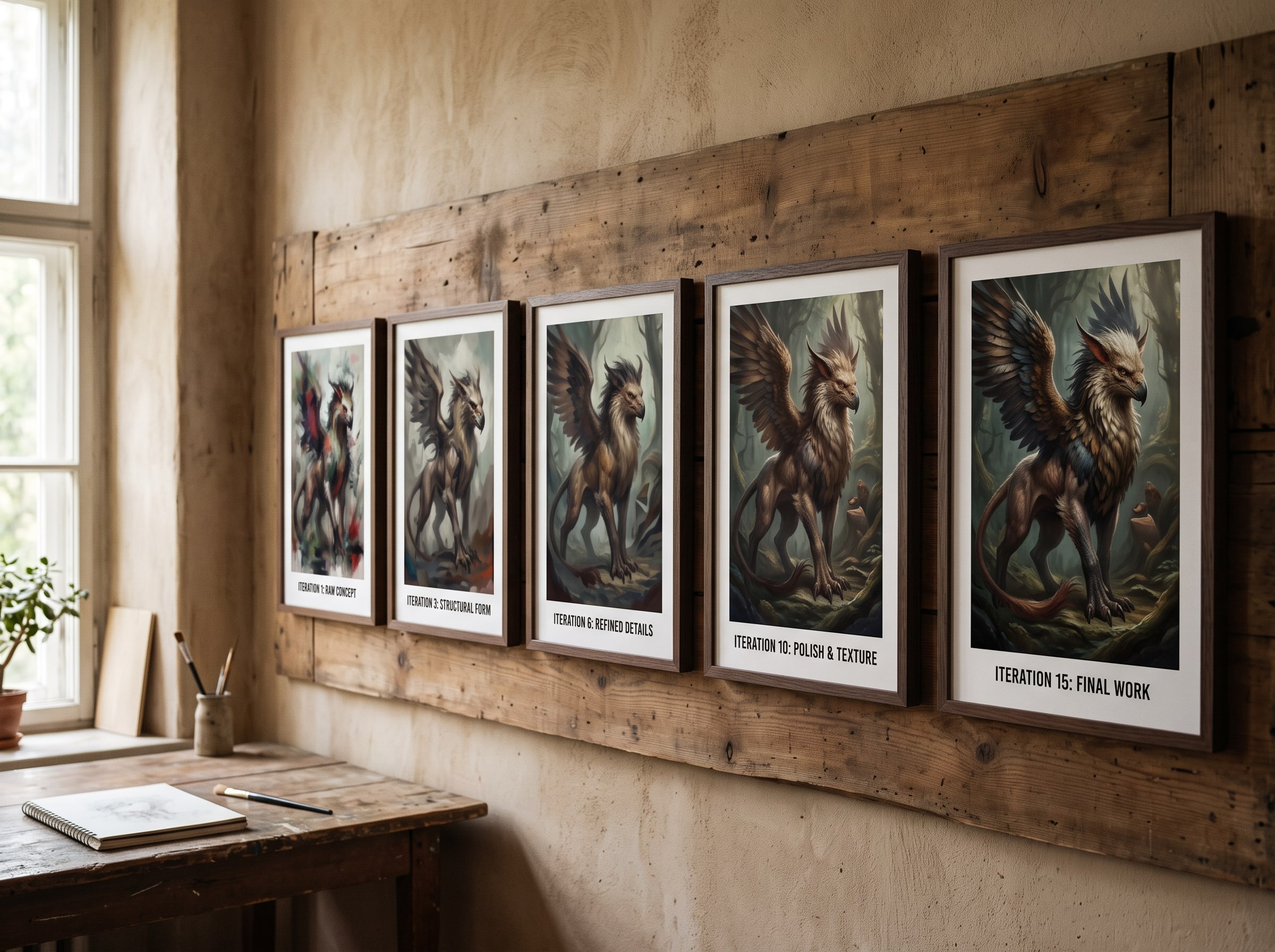
The first generation is rarely the final one, and that is normal — even for experienced creators. Professional digital artists work in layers and revisions; AI art follows the same rhythm at a faster clock speed. The skill is learning to read what is working in a result and what needs a nudge. Train your eye to scan four things in order: composition (where is the visual weight?), subject (is the likeness or focal point correct?), color (does the palette match your intent?), and atmosphere (does it feel the way you wanted?). Fix the highest-priority problem first.
When to Regenerate vs. Start Over
Regenerate when the composition, style, and subject are close but the execution is off — wrong expression, slightly off colors, a background element you dislike. Start over when the fundamental direction is wrong — you wanted abstract and got photorealistic, or the style clash is too deep to fix with a tweak. In Pablo AI, regenerating keeps your journey settings intact, so you are always one tap away from a fresh take without rebuilding from scratch.
Use a systematic iteration approach. First pass: evaluate without changing anything — does the overall direction work? Second pass: adjust mood words or one setting element, regenerate three to five times, and pick the best. Third pass: fine-tune prompt details — background, lighting, small props — and regenerate again. If three passes do not get you close, switch style or journey rather than grinding the same settings. Persistence is good; stubbornness is not.
Browse the gallery when you feel stuck. Seeing how other creators combined journeys, styles, and subjects often unlocks an approach you had not considered. Imitation is not cheating here — it is how every artist learns. Notice which styles appear repeatedly in rooms similar to yours. Notice which aspect ratios dominate gallery wall layouts. Then return to Pablo Studio and apply what you observed.
The best AI art does not look like AI made it. It looks like you made a series of deliberate choices — and the machine happened to be fast enough to keep up. — Pablo AI Creative Team
Building a Cohesive Collection: Creating Multiple Pieces That Work Together
A single great print is satisfying. A coordinated collection is transformative. Gallery walls, themed series, and matching gift sets elevate AI art from one-off experiments to intentional design — and Pablo AI makes collection-building practical because your journey settings, style selections, and mood parameters carry across regenerations. Once you find a palette and aesthetic that works, you can produce companion pieces without starting from zero each time.
Start with an anchor piece. Generate one image you love unconditionally — this becomes the reference for everything else. Note its dominant colors, its mood, its style selection, and its aspect ratio. For subsequent pieces, keep the style and mood settings locked while varying the subject or composition. A trio of abstract landscapes in the same sage-and-terracotta palette reads as a deliberate series even when each scene is different. Three Pet Painter portraits in the same Renaissance style but for different pets become a charming staircase gallery.
Color coordination is the fastest way to unify a collection. Extract two or three dominant colors from your anchor piece and name them explicitly in prompts for companion pieces — "soft sage green, warm terracotta, cream highlights" repeated across generations creates visual coherence even when subjects vary wildly. Avoid introducing a fourth dominant color unless you want that piece to stand apart as an accent. For gallery walls, limit your palette to three colors plus neutrals and the wall will feel designed rather than accumulated.
Themed series give collections narrative structure. Seasonal sets — spring botanicals, summer coastlines, autumn forests, winter minimalism — work beautifully in dining rooms and open stairwells. Room-specific sets coordinate with existing furniture: warm abstracts for a grey sofa, cool landscapes for a wood-paneled office, playful graphics for a kid's room. Gift sets pair a main portrait with smaller companion pieces — a Famous Artists portrait plus two small abstract color studies in matching tones makes a wedding or anniversary gift feel curated rather than single-purpose.
- Gallery wall triptych: three landscape pieces in the same palette, uniform aspect ratio, varied horizons
- Staircase portrait series: one Pet Painter or family portrait per step, consistent style, different subjects
- Seasonal rotation: four Art Print pieces keyed to seasons, swap frames quarterly
- Office focus set: one large landscape anchor plus two small abstract companions in matching tones
- Nursery collection: soft illustrated animals in a shared pastel palette, square format grid
- Gift bundle: main portrait plus two coordinating abstracts sized for shelf or desk display
- Kitchen trio: bold graphic still lifes in complementary colors, uniform square format
- Hallway narrative: progressive landscapes suggesting a journey — forest to meadow to coast
Use the gallery as a mood board: Before building a collection, browse the Pablo AI gallery and save mental notes on multi-piece layouts you admire. Pay attention to spacing, frame consistency, and palette repetition. Then return to Pablo Studio and generate your series with those principles in mind — same style, same mood words, varied subjects.
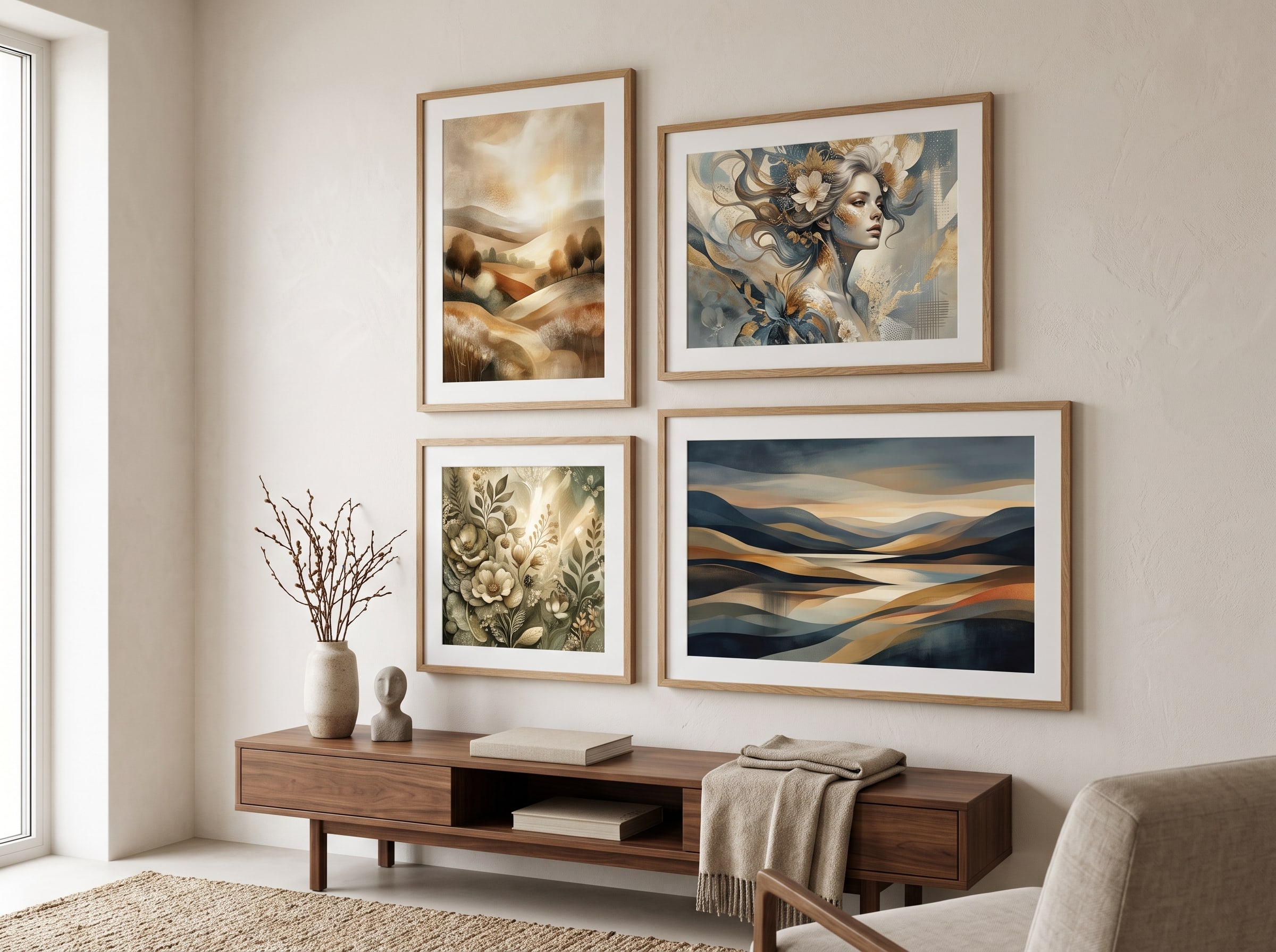
When ordering prints for a collection, batch your decisions. Select all sizes and frames at once so molding and mat colors stay consistent. Preview the full set in context if your products flow supports it. And leave breathing room — gallery walls need negative space between frames. A common mistake is sizing pieces too large for the wall and losing the cohesion that spacing provides.
From AI Generated Art to Physical Prints
Digital files are satisfying to create, but art lives in space. A screen cannot capture the texture of fine art paper, the way light shifts across a matte surface, or the weight of something you chose and framed yourself. That is why Pablo AI built a direct pipeline from creation to print — so the image you fell in love with on your phone survives the transition to your wall without losing the qualities that made you save it in the first place.
Once you have an image you love, continue to ArtPaper — Pablo AI's premium print product. ArtPaper uses archival-quality materials designed specifically for AI generated art, with color profiles tuned to preserve the vibrancy and detail your image had on screen. Choose your size, preview it in a room setting, and order. You can also explore other products if you want alternatives like canvas or framed options.
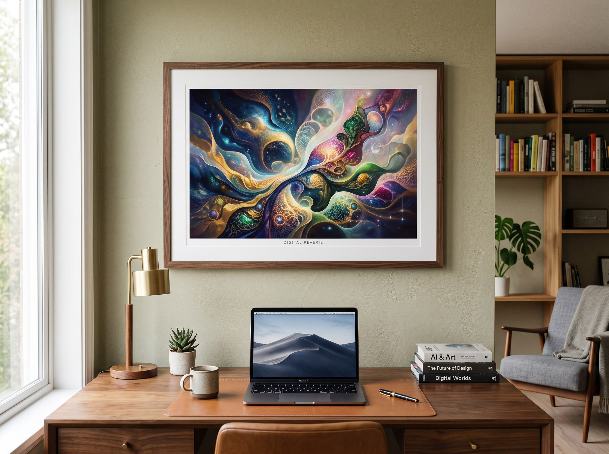
Framing choices shape how your art reads in a room. A simple black or white frame keeps focus on the image and suits modern and abstract work. Natural wood frames warm up cool-toned landscapes and impressionist pieces. Ornate gold or silver frames elevate Famous Artists portraits and formal subjects. Float mounts, where the print sits within a mat with visible space around the edges, add gallery sophistication to bold graphics and abstracts. For a cohesive collection, match frame molding across all pieces even if sizes differ — consistency in frame style unifies varied subjects.
Mat boards deserve attention too. A white mat creates breathing room and suits most styles. A colored mat can echo a dominant tone in the print — sage mat beneath a forest landscape, cream mat beneath a warm portrait. Avoid mats that introduce colors not present in the artwork; they compete rather than complement. For large statement pieces, consider going frame-only without a mat to maximize image impact. For smaller pieces in a gallery grid, mats in uniform width create visual rhythm even when image sizes vary slightly.
Room placement affects perception as much as framing. Hang art at eye level — the center of the piece roughly 57 to 60 inches from the floor — unless you are filling a specific architectural zone like the space above a sofa, where the bottom of the frame should sit 6 to 8 inches above the furniture. Bold, high-contrast pieces anchor minimalist rooms because they supply visual energy without clutter. Softer, tonal work suits bedrooms and reading nooks where calm matters. In dining rooms, consider what guests see while seated — lower placement sometimes works better than standard eye level.
Lighting completes the equation. Natural indirect light shows true color without glare. Avoid hanging prints in direct sunlight — even archival materials fade over time with UV exposure. For rooms without good natural light, picture lights or directional ceiling spots add warmth and reveal texture in art paper that ambient room lighting flattens. If you are creating a gallery wall, generate two or three complementary pieces in the same journey with coordinated palettes — Pablo AI makes this easy because your style and mood settings carry across regenerations.
A practical note on resolution: Pablo AI generates at print-ready sizes for standard formats, but if you plan to go large — think 24×36 inches or bigger — favor compositions with clean focal points and avoid fine text or micro-details that may soften at scale. The journeys are optimized for this, which is one reason guided creation beats raw prompting for wall art specifically. Many creators browse products alongside the gallery to see sizing and framing options before they commit to a direction.
- Save your final image from the journey review step
- Navigate to ArtPaper and select your print size
- Preview the print in context before ordering
- Choose framing: simple for modern work, wood for warm tones, ornate for classical styles
- Consider mat color that echoes the print palette rather than introducing new colors
- Hang at eye level or adjusted for furniture — 6 to 8 inches above a sofa back
- Step back, check lighting, and notice how different it feels from the screen version
Print closes the creative loop: Creators who never print often burn out on endless digital iteration. Something changes when you see your art at full scale on paper — flaws you ignored on screen become obvious, and qualities you missed become visible. Print early, even at a small size, to calibrate your eye for what works at physical scale.
Common Mistakes Beginners Make with AI Art Generators
We see the same patterns in support conversations and community feedback. Avoiding these early will save you frustration and get you to art you are proud of much faster. Most mistakes come from treating AI art like a search engine — type a request, expect a perfect result — rather than a collaborative process that rewards iteration and intentional choices.
- Expecting perfection on the first generation — treat iteration as the default, not failure
- Overloading prompts with contradictory instructions ("minimalist but also extremely detailed with many elements")
- Ignoring the style library and trying to describe complex aesthetics purely in text
- Creating at the wrong aspect ratio for the intended use — check print dimensions before you finalize
- Never printing the result — the full creative loop closes when you see your art in physical space
- Generating companion pieces without locking style and mood settings — collections look random instead of curated
- Choosing frames that compete with the artwork instead of supporting it
A note on originality: AI art generators remix learned visual patterns — your unique contribution is curation, combination, and intent. If you plan to sell or commercially license your work, review Pablo AI's terms of service and understand the usage rights for your specific plan.
Start Creating Your AI Art — Pick a creative journey, choose a style, and generate your first AI art in minutes. No prompt engineering degree required.
Frequently Asked Questions About AI Art
Do I need any art skills to create AI art?
No traditional art skills are required. You need taste, patience, and willingness to iterate. Pablo AI's guided journeys handle the technical side — style selection, composition defaults, and print-ready output — so you focus on creative decisions rather than software mastery.
Is AI generated art copyright-free?
Copyright for AI art is a evolving legal area and varies by jurisdiction. Pablo AI grants you usage rights to images you create on the platform according to your plan's terms. If you intend to sell prints, use images commercially, or submit to contests, review the current terms of service and consult a legal professional for commercial use cases.
What makes Pablo AI different from other AI art generators?
Most AI art generators give you a text box. Pablo AI gives you structured creative journeys — visual style libraries, subject-specific workflows, in-context regeneration, and a direct path to premium physical prints through ArtPaper. It is designed for people who want finished art, not just experiments.
How long does it take to create AI art with Pablo AI?
Most users go from journey selection to a saved image they love in ten to twenty minutes. Printing adds a few more minutes for size and product selection. Complex projects with many iterations may take longer, but the per-generation time is seconds, not hours.
Can I print AI art I created on Pablo AI?
Yes — that is one of the platform's core features. After saving your image, continue directly to ArtPaper for archival-quality prints in multiple sizes. Pablo AI calibrates output for print fidelity so colors and detail survive the transition from screen to paper.