Your walls are the largest canvas in your home — and most of them are still waiting for something worth staring at. AI art home decor changes that equation entirely. Instead of scrolling through generic stock prints or settling for mass-produced posters, you can create pieces that match your exact aesthetic, your exact colors, and your exact mood. Whether you are hunting for bold wall art ideas, subtle AI poster ideas for a gallery wall, or a complete vision for home decoration with AI art, this guide walks you through fifteen room-by-room concepts that designers wish their clients would ask for. No two homes are alike, and neither should their art be.
Each idea below includes suggested art styles, placement guidance, and the atmosphere it creates — so you can picture the finished room before you generate a single pixel. If you are new to generating your own pieces, start with our guide on how to create AI art, then explore our creative journeys to start designing art that belongs on your walls, not someone else's Pinterest board. By the time you reach the last idea, you will have a room-by-room plan — and the confidence to print something extraordinary.
Before You Start: How to Assess Your Space for AI Art
The most expensive mistake in home decoration is not choosing the wrong frame — it is choosing the right art for the wrong wall. Before you generate a single image, treat your room like a brief: measure, observe, and photograph. Pull out a tape measure and note the width and height of each candidate wall, the distance from the ceiling, and the width of any furniture below (sofa, bed, console, dining table). These numbers determine whether a 24×36 inch print feels commanding or lost, and whether a gallery cluster will breathe or feel cramped. Write the measurements on your phone alongside a photo of each wall — you will reference them constantly when sizing and cropping.
Next, identify anchor walls versus accent walls. An anchor wall is where your eye naturally lands when you enter a room — usually the wall behind the sofa, the headboard wall, or the surface opposite the main doorway. These deserve your boldest AI art home decor: oversized abstracts, dramatic portraits, saturated color blocks. Accent walls — narrow strips beside a window, the space above a sideboard, the wall flanking a fireplace — work better for smaller pieces, vertical formats, or curated pairs. Understanding this hierarchy prevents the common trap of hanging your most ambitious piece where nobody looks.
Lighting and color palette are equally decisive. Walk through each room at morning, midday, and evening, noting where natural light falls and where shadows pool. North-facing rooms tend toward cool, flat light — warm-toned AI art (terracotta, amber, blush) compensates beautifully. South-facing rooms flood with golden light — cooler palettes and high-contrast pieces hold their own without washing out. Artificial lighting matters too: a piece that glows under warm sconces may look flat under cool LED recessed cans. Finally, inventory your existing palette — upholstery, rugs, cabinetry, tile — and decide whether your art should harmonize (pulling two colors from the rug into the print) or deliberately contrast (a neon pop art piece against an all-neutral room). Browse our breakdown of AI art styles for every room once you know your palette; style and color work together.
Photograph Your Room Before You Generate: Take a wide-angle photo of each wall you plan to decorate, in daylight, with furniture in place. Upload it to your phone and overlay screenshots of AI art candidates on top. This thirty-second trick reveals scale, color clashes, and proportion problems before you spend a dollar on printing. When you are ready to order, our guide to digital art to physical prints walks you through sizing and paper choices matched to your photos.
- Measure every candidate wall and the furniture below it — record width, height, and ceiling clearance
- Photograph each wall in natural daylight and note which direction the room faces
- Identify one anchor wall per room for statement pieces; reserve narrow walls for accent art
- Audit your existing color palette (textiles, flooring, cabinetry) and decide: harmonize or contrast
- Test artificial lighting at night — note warm vs. cool bulbs and any glare on glossy surfaces
- Choose a style direction using our AI art styles guide before generating
- Generate two to three variations per concept and compare against your room photos before printing
Living Room & Common Areas
The living room is where guests form their first impression of your home — and where you spend your slowest, most comfortable hours. These five AI art home decor ideas turn shared spaces into galleries of personality. Because this is typically the largest open wall in the house, proportion matters enormously: a piece that is too small looks like an afterthought, while one that is too large swallows the furniture below it. The ideas here balance scale, color, and mood so your living room feels collected rather than decorated.
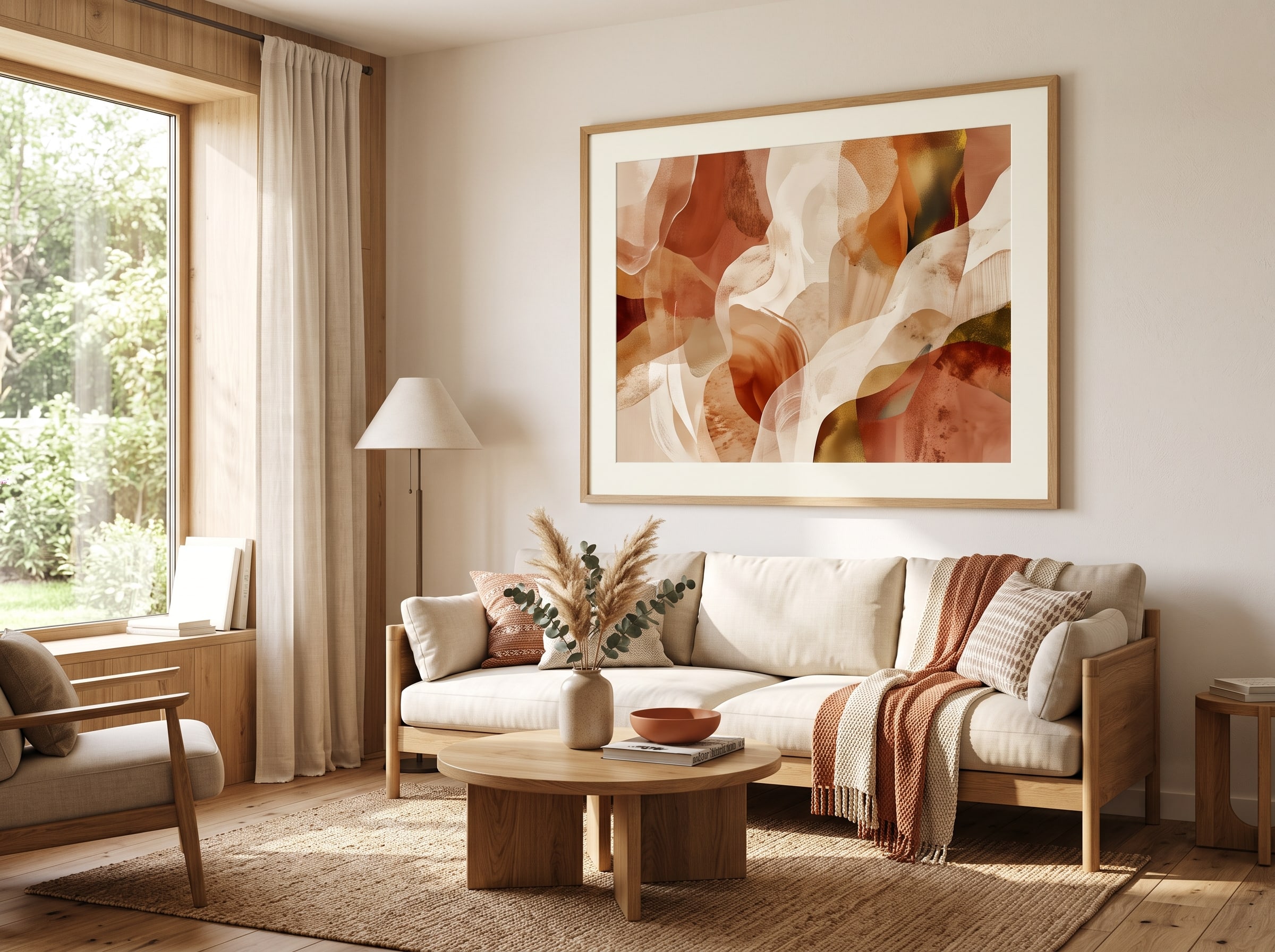
1. Oversized Abstract Above the Sofa
Picture a single sweeping canvas — fluid shapes in ochre, slate, and soft ivory — hung so its center sits roughly six to eight inches above your sofa back. This is the classic statement move, and AI makes it effortless to match your upholstery exactly. Request abstract expressionist or color-field styles with a palette pulled from your throw pillows and rug. The brushwork can be loose and gestural or smooth and meditative; either way, the scale is what transforms a blank wall into architecture. Guests notice it before they sit down — a silent signal that this room was designed with intention, not assembled from a catalog.
For placement, the piece should span roughly two-thirds the width of your sofa for proportional balance — on a ninety-inch sectional, aim for a canvas around sixty inches wide, or pair two complementary panels that together hit that ratio. Hang the center of the artwork at fifty-seven to sixty inches from the floor, adjusting slightly if your ceilings are unusually high or low. If your sofa sits in front of a window, choose a piece with enough visual weight to compete with daylight without fighting it — deeper tones and larger forms hold their own. The mood is confident and gallery-like: your living room suddenly reads as intentional, collected, and quietly luxurious, as though an interior designer chose every brushstroke to complement your linen sectional. When you are ready to print at this scale, see our printing guide for large-format options.
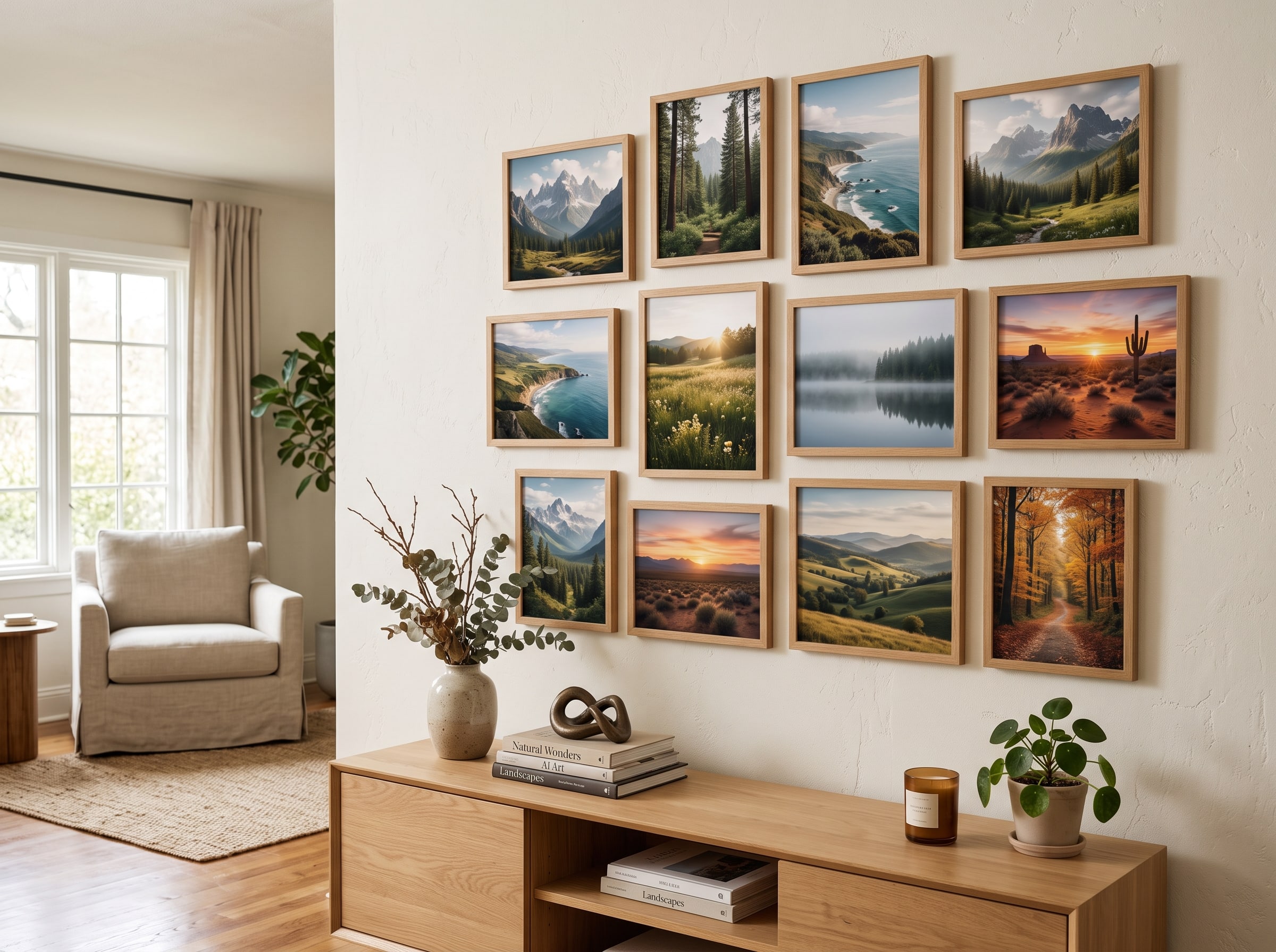
2. Curated Gallery Wall of AI Landscapes
Instead of one hero piece, imagine a salon-style arrangement of five to nine framed AI landscapes — misty mountains, golden-hour coastlines, ethereal forests — unified by a consistent color temperature. Mix orientations and sizes for visual rhythm, keeping frames identical in finish (matte black or natural oak work beautifully). Generate each scene in impressionist or atmospheric digital painting styles so they feel like a cohesive travel diary rather than random postcards. The collection tells a story: places you have been, places you dream of going, or purely imagined worlds that share the same golden-hour glow.
Lay the arrangement on the floor before you commit to nail holes — start with the largest piece slightly left or right of center, then build outward, keeping two to three inches between frames. Hang the cluster so the visual center sits at eye level, roughly fifty-seven to sixty inches from the floor. A gallery wall works best on a wall with minimal competing elements — avoid placing it directly beside a busy bookshelf or a television. The atmosphere is wanderlust and warmth: guests will lean in to study each scene, tracing coastlines and mountain ridges with their eyes, and the room will feel layered, worldly, and deeply personal. For style consistency across every frame, reference our AI art styles guide and generate the full set in a single session.
3. Minimalist Line Art in Neutral Tones
For Scandinavian or Japandi interiors, a single line-drawing portrait or botanical sketch in charcoal on warm white paper is pure quiet elegance. AI excels at generating continuous-line figures, architectural sketches, and single-stem florals with the restraint of a hand-drawn original. The beauty is in what is left out — no color, no shading, just confident strokes that imply form with a few millimeters of ink. In a room full of natural materials — oak, linen, stone — this kind of art feels like a breath: present but never demanding.
Place one large piece on a blank wall opposite a window so natural light grazes the fine lines and creates subtle shadow play throughout the day. Alternatively, pair two smaller vertical prints flanking a doorway or console for symmetrical calm. Stick to black, warm gray, or muted taupe linework — no color needed, and in fact color would break the spell. Size the single piece generously: a twenty-four by thirty-six inch line drawing on an otherwise empty wall reads as sculpture. The mood is serene and uncluttered: breathing room for the eye, a sense that every object in the room was chosen with purpose. Guests notice the silence before they notice the art — and that is exactly the point.
4. Bold Pop Art Statement Piece
If your living room plays it safe with neutral furniture, a single vibrant pop art print can electrify the entire space. Think Warhol-inspired color blocks, graphic portraits with halftone dots, or neon typography on a saturated background. Generate in retro screen-print or comic-book styles, then scale it large — thirty-six by forty-eight inches or bigger — on a wall that needs energy, such as the one visible from your entryway. The contrast between restrained furniture and explosive art creates a tension that designers love: the room feels edited, not boring.
Keep surrounding decor minimal so the piece can shout — remove competing patterns from nearby pillows and rugs, or deliberately choose solids that echo one color from the print. Hang it at standard gallery height but give it generous lateral space; pop art needs room to breathe on both sides. If you are nervous about commitment, generate three variations in different colorways and live with the digital previews for a week before printing. The atmosphere is playful, youthful, and conversation-starting: dinner parties will orbit around it, someone will always ask where you found it, and your space will finally feel like it has a sense of humor. Pop art is one of the most print-rewarding styles — bold flat color absorbs beautifully on museum-quality art paper.
5. Seasonal Rotating AI Art Display
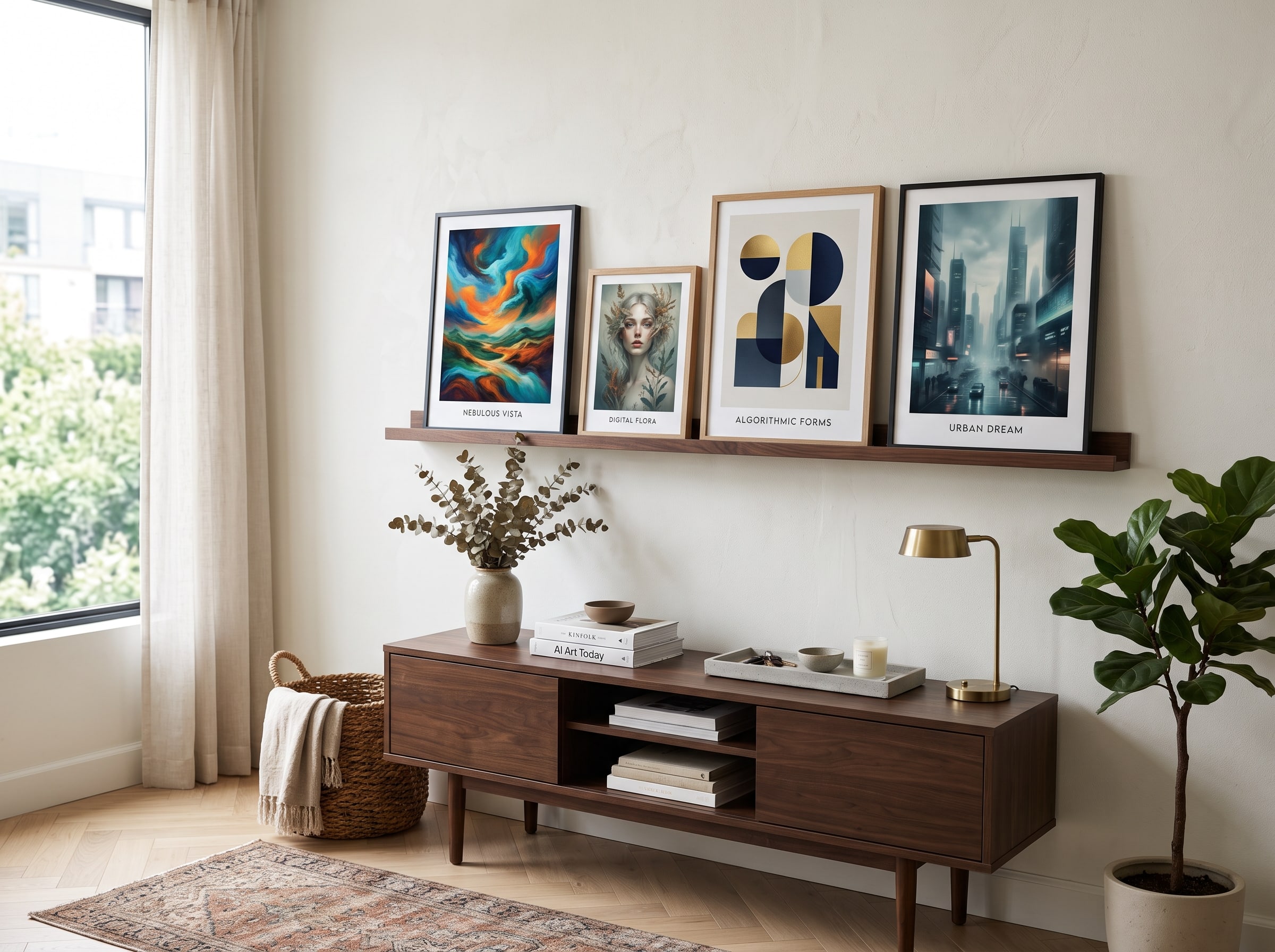
Why commit to one look forever? Create a rotating collection of AI poster ideas tied to the seasons — amber foliage in autumn, cool blues and whites in winter, cherry blossoms in spring, sun-bleached coastal scenes in summer. Use a simple picture ledge or interchangeable magnetic frames so swapping takes seconds. Generate each season's set in a consistent style (watercolor washes work beautifully) so transitions feel curated rather than random. The ledge itself becomes part of the decor: a shallow shelf in natural wood or matte black, mounted at eye level, holding two or three framed pieces you rotate as the months turn.
Place the ledge on a prominent wall near your main seating area — the wall beside the sofa, above a sideboard, or flanking a fireplace mantel. Generate four to six pieces per season so you can pair or trio them without repeating the same arrangement. Store off-season prints flat in a portfolio sleeve rather than stacked, to protect corners and keep colors vivid. The mood is fresh and alive: your home never feels static, and visitors will notice something new every time they walk through the door. Seasonal rotation is also one of the most budget-friendly approaches to AI art home decor — one ledge, four sets of prints, and an entire year of ever-changing walls.
Interior Design Tip: The Two-Thirds Rule: When hanging art above furniture, aim for a piece that is roughly two-thirds the width of the item below it — whether that is a sofa, console table, or bed. Leave six to eight inches of breathing room above the furniture top. This single proportion trick makes AI art home decor look professionally installed every time.
- Abstract expressionism — ideal for living rooms with neutral palettes that need a color anchor
- Impressionist landscapes — perfect for gallery walls and transitional spaces
- Minimalist line art — best for Scandinavian, Japandi, and modern minimalist interiors
- Pop art and screen-print styles — great for energizing safe furniture choices
- Seasonal watercolor sets — wonderful for ledge displays and rotating collections
Bedroom & Private Spaces
Bedrooms are sanctuaries — the art here should whisper, not shout. These four ideas use AI art home decor to create retreats that feel tailored to how you rest, dream, and recharge. Unlike living rooms, where art performs for guests, bedroom art performs for you: the last image you see before sleep and the first you see at waking. Scale, palette, and emotional tone matter more than boldness.
6. Dreamy Watercolor Above the Headboard
Imagine waking to soft washes of lavender, blush, and pale gold bleeding into one another like a horizon at dawn. A horizontal watercolor-style AI piece hung centered above your headboard becomes the emotional anchor of the room. Request delicate botanical forms, abstract cloudscapes, or gentle gradient fields in muted pastels — nothing sharp, nothing high-contrast. The edges should feel like they dissolve into the wall, as though color itself is exhaling. In a room with white or cream bedding, the art supplies all the warmth the space needs.
Size it roughly equal to the headboard width — slightly wider is fine, but avoid overpowering the bed. On a queen headboard around sixty inches wide, a print in the fifty-to-sixty-inch range (including mat) feels balanced. Hang the bottom edge six to eight inches above the headboard top, keeping the center around fifty-seven inches from the floor. Print on museum-quality art paper for texture that catches morning light and mimics the tooth of real watercolor stock. The mood is tender and restorative: the last thing you see at night and the first thing you see in the morning both feel like a deep exhale. Watercolor is among the most forgiving styles for bedrooms — explore variations in our AI art styles guide.
7. Intimate Botanical Series
Line your bedroom wall with a trio of close-cropped botanical studies — a single peony, a fern frond, a sprig of eucalyptus — each rendered in soft gouache or vintage illustration style. The repetition of subject matter with subtle variation creates rhythm without monotony: same family, different personalities. AI generates each study with consistent line weight and palette so the series feels intentional, as though an artist spent a season observing your favorite plants. Guests may not comment on the art directly, but they will describe the room as "calm" or "fresh" — the botanicals do their work quietly.
Hang them at staggered heights along the wall beside your bed or dresser, keeping eight to twelve inches between frames. Use identical frames in thin natural wood or soft white — uniformity matters more here than in a salon-style gallery wall. Choose a palette that echoes your bedding: sage and cream for linen duvets, dusty rose for velvet accents, deep green for moody dark walls. Each frame can be eleven by fourteen or sixteen by twenty inches; the series reads best when the largest is in the middle and the two flanking pieces step down slightly in size. The atmosphere is organic and nurturing, like sleeping inside a greenhouse filled with morning dew.
8. Moody Noir Photography Style
For bedrooms that lean dark and dramatic — charcoal walls, brass fixtures, velvet drapes — a single AI piece in cinematic noir photography style is transformative. Think rain-slicked city streets at midnight, a lone figure in a doorway, or a fog-draped forest rendered in deep monochrome with a single accent of amber light. The image should feel like a still from a film you would watch alone on a rainy evening: moody, layered, and slightly unresolved. AI excels at this style because it can control the exact ratio of shadow to highlight, placing that one warm accent where your eye needs to land.
Place it on the wall opposite the bed so it is the first visual anchor when you enter the room — not above the headboard, where darkness might feel oppressive at eye level while lying down. One large vertical format (twenty-four by thirty-six inches) is enough; the darkness of the image should complement, not compete with, your wall color. If your walls are already dark, choose an image with slightly lighter midtones so the piece does not disappear. Frame it in thin matte black or unframed with a float mount for a gallery edge. The mood is mysterious and cocooning: a private cinema where you are always the protagonist, and the room feels like a retreat from the brightness of the world outside.
9. Personalized AI Portrait Niche
Turn a small alcove, reading corner, or the wall above your vanity into a personal gallery with an AI-generated portrait — of yourself, a loved one, or a beloved pet — reimagined in the style of a famous artist's journey. Van Gogh swirls, Art Nouveau linework, or Art Deco geometry applied to a familiar face creates something deeply yours and utterly unrepeatable. This is the opposite of mass-market decor: a piece that could exist only in your home, for your eyes, commemorating your life. The niche format — a small wall, an intimate corner — makes the portrait feel discovered rather than displayed.
Keep the frame ornate or gilded for a touch of old-world intimacy, or go modern with a thin black float frame if your bedroom skews contemporary. Size the portrait for the space: an eight by ten or eleven by fourteen feels right above a vanity; a sixteen by twenty commands a reading nook. Light the niche with a small sconce or picture light if the corner is shadowed — portraiture rewards directed illumination. Generate two or three style variations before committing; a pet in Art Nouveau linework may surprise you compared to the same pet in Van Gogh brushwork. The atmosphere is heirloom and sentimental: a piece that could never be bought off a shelf, only created for this room and this life.
The aim of art is to represent not the outward appearance of things, but their inward significance — and nowhere does that matter more than the walls of the home you live in every day. — Adapted from Aristotle
Explore Journeys — Browse our creative journeys and generate AI art tailored to your rooms, your colors, and your mood — then order gallery-quality prints shipped to your door.
Kitchen & Dining
Kitchens and dining rooms are the heart of hospitality. The right AI art home decor here should feel appetizing, warm, and conversation-friendly — never stiff or formal. These spaces also present unique practical challenges: humidity, grease, splashes, and the visual noise of open shelving and appliances. The three ideas below account for all of it, choosing styles and placements that thrive where other art would feel out of place.
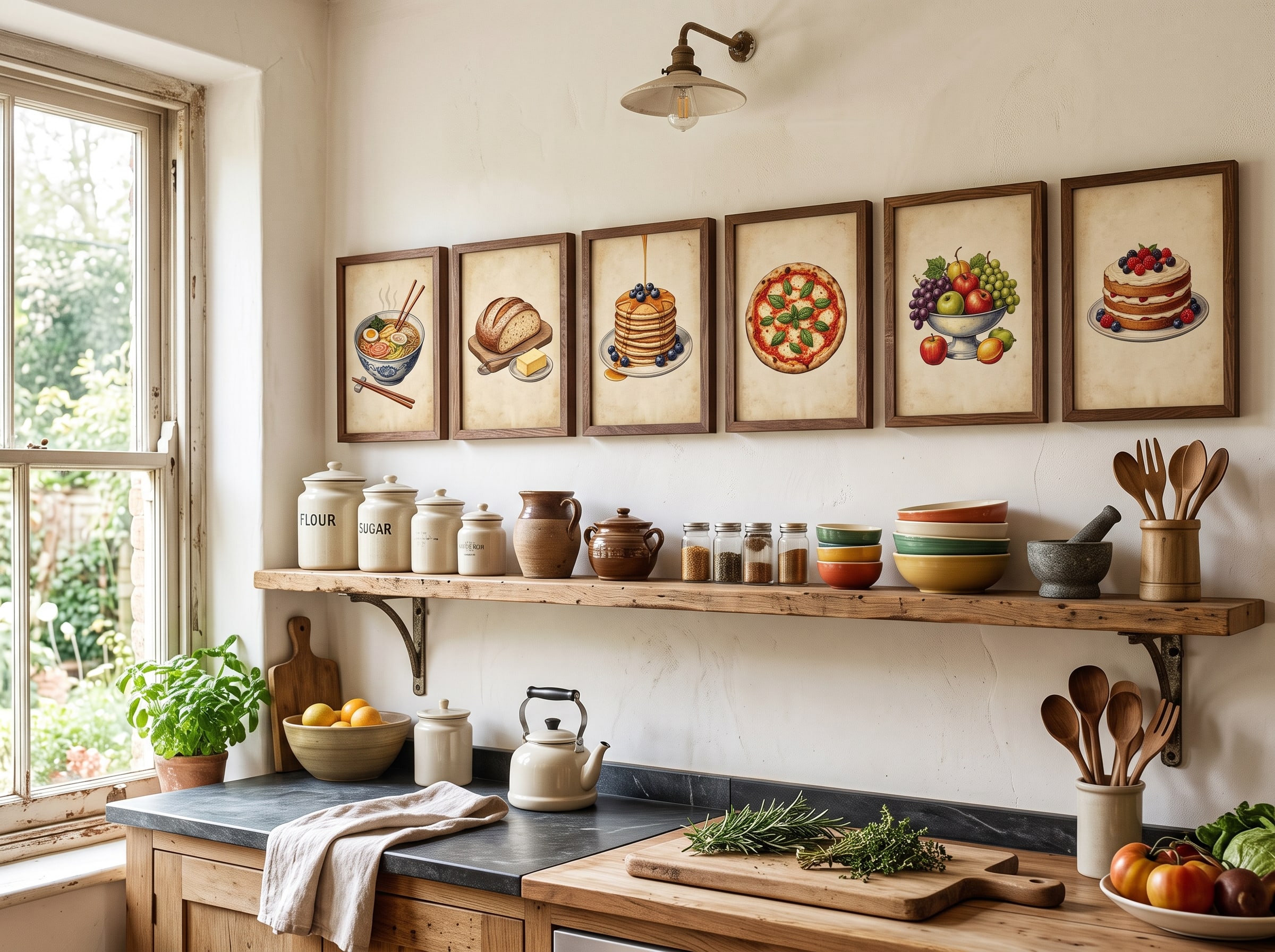
10. Vintage Food Illustration Prints
Picture a row of charming vintage-style illustrations — citrus cross-sections, herb bundles, artisan bread loaves — rendered in warm ink-and-watercolor technique along your dining wall or above open shelving. AI can generate these with the nostalgic charm of nineteenth-century botanical plates, complete with handwritten-style labels and subtle paper texture. Each illustration feels like a page torn from an old kitchen journal: intimate, handmade, and full of appetite. The warmth is immediate — guests feel invited before anyone pours the wine, and the room smells like bread even when nothing is in the oven.
Arrange three to five in uniform frames along a horizontal line above a sideboard or breakfast nook bench, spacing them evenly with four to six inches between frames. The palette should complement your cabinetry: cream illustrations on sage walls, or warm terracotta tones against white subway tile. Avoid placing them directly above the stove — heat and grease accumulate over time. Instead, choose the dining wall, the space above open shelving away from the cooktop, or a narrow wall beside the pantry. Eleven by fourteen or eight by ten sizes work well in a row; mat them in warm white for a vintage print-shop feel. The mood is rustic and welcoming: your kitchen reads as a place where meals are made with care, not just consumed in haste.
11. Abstract Color Block for Open Shelving
Modern kitchens with open shelving often struggle with visual clutter — dishes, cookbooks, plants, and ceramics competing for attention on every surface. A single bold abstract color-block print — geometric shapes in two or three hues that mirror your dishware or tile — provides a focal point that organizes the eye. Generate in mid-century modern or Bauhaus-inspired styles with clean edges and saturated, food-friendly colors like cerulean, mustard, and coral. The abstraction gives the brain a place to rest amid the detail of open storage, like a deep breath between sentences.
Hang it on the largest open wall, sized to balance (not match) your shelving run — if your shelves span six feet, a print around thirty by forty inches creates proportional weight. Position the center at fifty-seven to sixty inches from the floor, or slightly higher if the piece sits above a counter rather than a seating area. Keep the surrounding wall clear — no competing shelves or hooks within twelve inches. If your dishware is neutral, let the print supply all the color; if your shelves are already vibrant, choose a two-color block piece that echoes your dominant hue without repeating every shade. The atmosphere is crisp and contemporary: your kitchen reads as designed, not just functional, and the art ties together objects that would otherwise feel disconnected.
12. Herb Garden Botanical Panel
For the cook who treats the kitchen as a creative studio, a tall vertical panel of illustrated herbs — basil, rosemary, thyme, mint — arranged in a grid or cascading composition brings the garden indoors. Request detailed botanical illustration style with Latin names in elegant script beneath each plant. AI renders each leaf vein, stem texture, and petal edge with the precision of a field guide, but the overall composition can be as structured or flowing as your kitchen demands. The scent is imaginary but the effect is real: the room feels connected to something growing, something alive.
Place it beside a pantry door, on a narrow wall between cabinets, or above a coffee station — anywhere a vertical format fits where horizontal art would feel awkward. A sixteen by twenty-four or eighteen by twenty-four inch size suits most narrow kitchen walls. Soft greens and cream tones keep the energy calm even during busy mornings; avoid high-contrast botanicals that might feel jarring before coffee. Frame in thin natural wood or leave unframed with a clip-frame for a utilitarian kitchen aesthetic. The mood is fresh and artisanal: every meal feels connected to the earth, and guests who cook with you will inevitably ask which herbs you grow — even if the garden exists only on your wall.
Kitchen-Friendly Printing: Kitchens and dining areas benefit from durable print materials. When ordering your AI poster ideas, choose finishes that resist humidity and can be wiped clean. Our art print journey walks you through paper and sizing options built for real-life rooms — not just showrooms. For detailed guidance on material choices, see digital art to physical prints.
Home Office & Creative Spaces
Whether you work from a dedicated study or a corner of the guest room, the art on your walls shapes focus, creativity, and the energy you bring to your day. These three AI art home decor ideas turn utilitarian workspaces into places you actually want to spend time. Consider what appears on camera during video calls, where your eyes rest during screen breaks, and what inspires you when a project stalls — the right piece addresses all three without cluttering a space that needs to function.
13. Motivational Typography AI Art
Hang a typographic AI piece directly in your line of sight from your desk — a single word or short phrase rendered in bold letterforms with subtle texture, gradient, or architectural shadow. Think "Create," "Focus," or a personal mantra in modern sans-serif or hand-lettered script styles. The word should be legible from across the room but interesting up close: letterforms with depth, texture, or a gradient that shifts as daylight moves. AI generates typography with a polish that would take a calligrapher hours, and you can iterate on the exact phrasing until it feels like yours alone.
Keep the background clean (white, soft gray, or a muted accent that matches your office palette) so the message reads instantly during video calls — busy backgrounds behind your head distract colleagues; a single clean typographic piece reads as intentional. Size it large enough to fill the wall segment behind your monitor without dominating the frame on camera: roughly twenty-four by thirty-six or thirty by forty inches for a standard desk setup. Hang it so the text center sits at eye level when you are seated. The mood is driven and purposeful: a daily reminder that this space exists for your ambitions, and a visual anchor that pulls your attention back when it wanders.
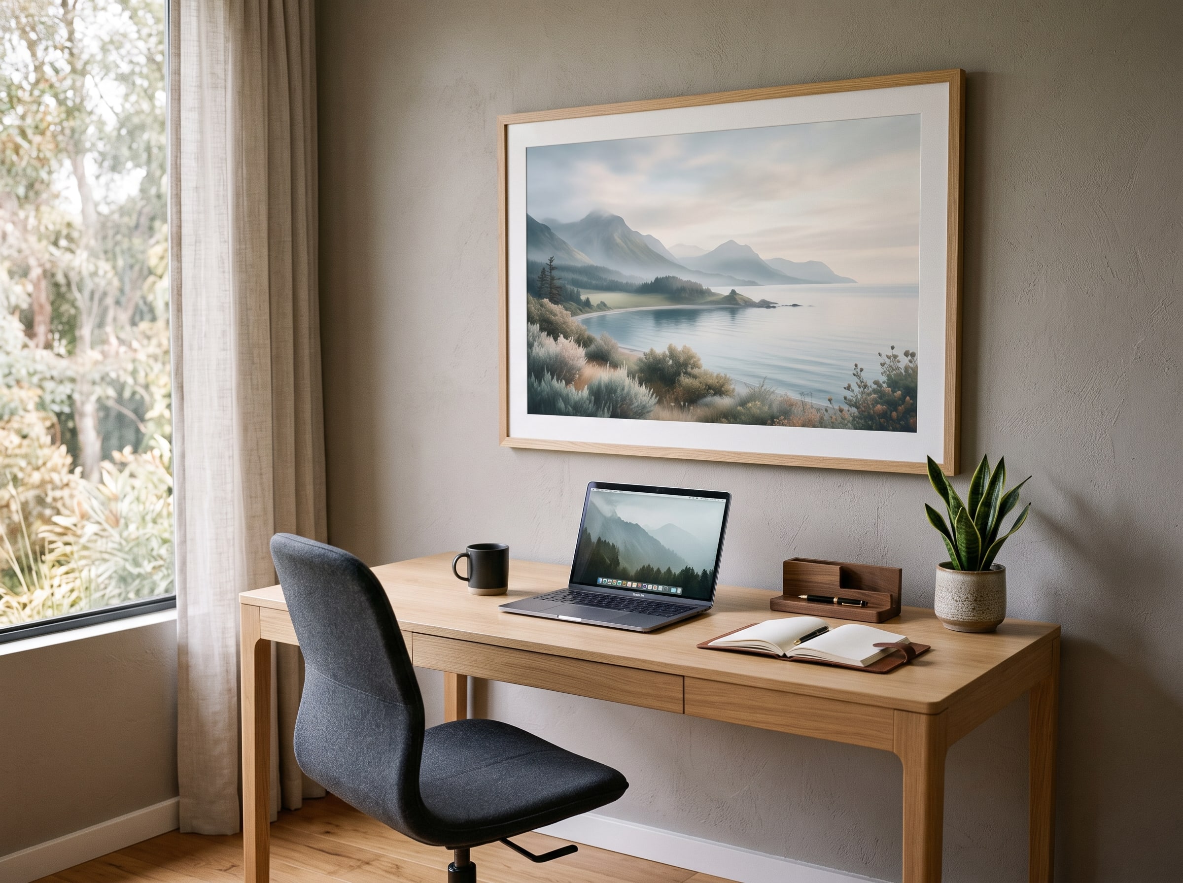
14. Calming Nature Scene for Focus
Productivity research consistently shows that nature imagery reduces stress and improves concentration — even when the "nature" is a photograph or painting rather than a window. Generate a wide-format AI landscape — a misty forest path, a still lake at dawn, rolling hills in soft focus — in photorealistic or soft pastel painting style. The scene should invite your eyes to travel: a path receding into distance, water reflecting sky, hills layered in atmospheric perspective. It becomes the place your mind goes during the ten seconds between tasks, a visual exhale that resets attention without pulling you out of work entirely.
Place it on the wall perpendicular to your screen so your eyes can rest on it during breaks — not behind your monitor, where you would never see it while working. Avoid overly detailed or high-contrast scenes that compete for attention; the goal is calm clarity, not a distraction. A wide horizontal format (twenty-four by thirty-six or thirty-six by twenty-four inches) suits most office walls. Soft greens, muted blues, and warm morning light work best; avoid neon foliage or dramatic storm clouds that spike cortisol rather than lowering it. The atmosphere is calm clarity: deadlines feel manageable, and the room feels like a retreat rather than a cubicle. Nature photography is one of the most versatile styles — see our full AI art styles breakdown for variations.
15. Creative Mood Board Collage Print
For designers, writers, and makers, a single large AI-generated collage that weaves together your aesthetic inspirations — color swatches, architectural details, abstract textures, typographic fragments — functions as both art and creative fuel. Request a mixed-media collage style with torn-paper edges, overlapping layers, and a cohesive palette drawn from your current project or brand. The piece looks like something pinned to a studio wall and then frozen in time: layered, tactile, and full of half-resolved ideas that spark new ones. Guests see art; you see a map of your creative thinking.
Hang it above a credenza or on the wall facing your primary work surface — the wall you glance at most often when staring out the window or pacing during a phone call. Size it generously: thirty by forty or even thirty-six by forty-eight inches, because collage art rewards close inspection and the layers need room to breathe. Generate the collage around a specific project palette so it evolves with your work — when the project changes, generate a new one and rotate. Frame simply in thin black or white; the collage itself is visually complex enough. The mood is eclectic and energizing: a living mood board that sparks new connections every time you glance up from your screen, and a conversation piece that reveals how you think, not just what you make.
- Typography and letterform art — anchors a desk-facing wall with daily intention
- Soft-focus nature photography — reduces stress and supports deep work
- Mixed-media collage — ideal for creative professionals who thrive on visual inspiration
- Architectural line drawings — adds sophistication to minimal home office setups
- Inspirational abstract gradients — subtle color energy without visual noise on video calls
Hallways, Entryways, and Forgotten Walls
Some of the most transformative walls in a home are the ones we walk past without thinking — the narrow hallway, the entry console, the stairwell that connects floors but never receives design attention. These transitional spaces set the emotional tone for everything beyond them. A blank entry says "pass through"; a considered entry says "you are welcome here." The two bonus ideas below treat these forgotten walls as opportunities, not afterthoughts.
Bonus: Entryway Welcome Statement
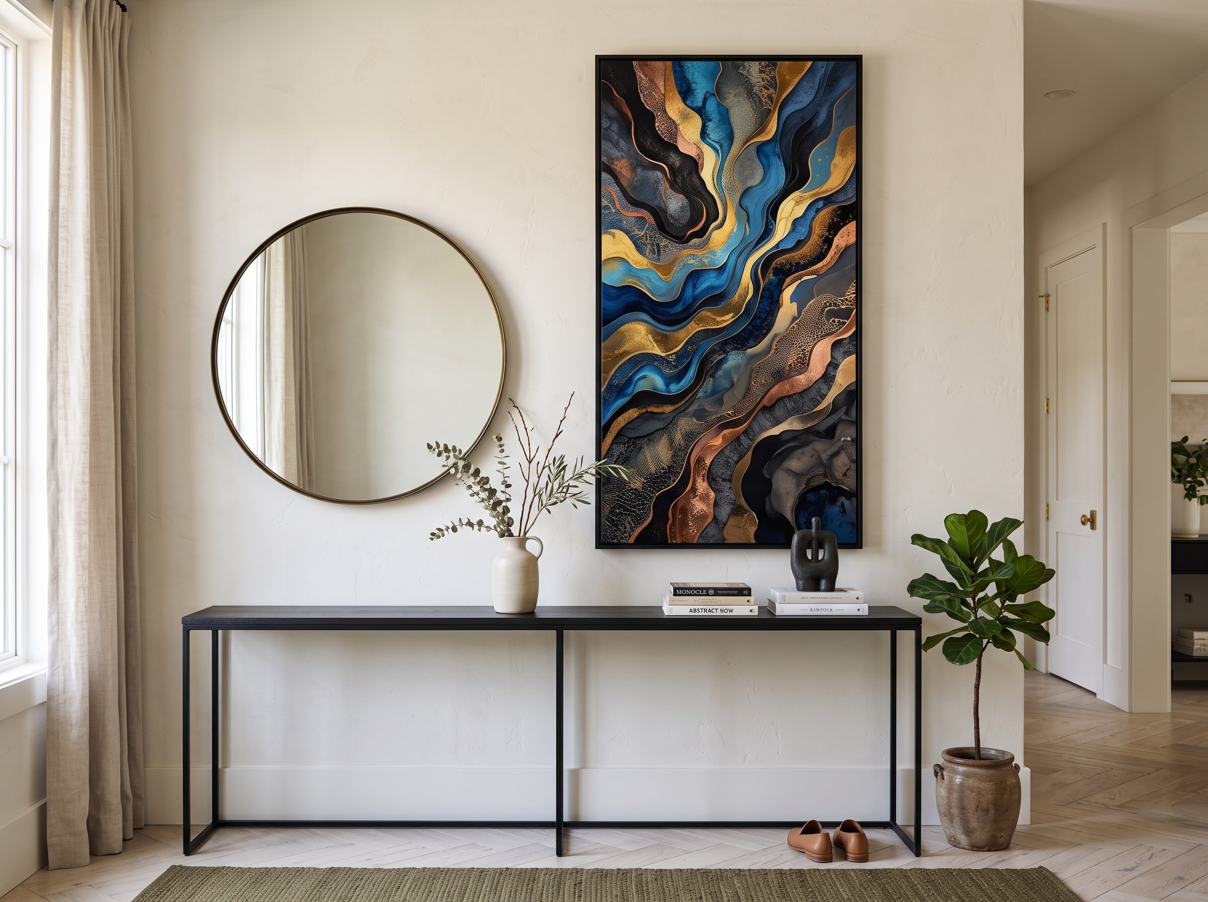
Your entryway is the handshake of your home — the first surface guests see after the front door, the last impression when they leave. A single dramatic piece or a mirror-flanking pair sets the tone for the entire interior before anyone reaches the living room. Imagine one oversized vertical portrait in rich Renaissance style, a bold abstract in colors that echo your living room rug, or two complementary botanical prints flanking a round mirror — symmetry that feels intentional, not symmetrical for its own sake. The scale can be bolder here than you might expect: entry walls are often narrow but tall, and a vertical format that fills the height reads as architecture.
Hang the statement piece at eye level on the wall opposite or adjacent to the entry door — the wall your guests face when they step inside. If using a mirror-flanking pair, center the mirror and place matching frames twelve to eighteen inches on either side, keeping the trio at fifty-seven to sixty inches center height. Choose art that previews the mood of the rooms beyond: warm and organic if your home is bohemian, cool and minimal if your aesthetic is Scandinavian, bold and graphic if your living room needs energy. Keep the console below uncluttered — one vase, one tray — so the art owns the vertical space. The atmosphere is arrival: guests pause, look up, and feel that they have entered somewhere considered. You will notice it too, every single day.
Bonus: Stairway Gallery Progression
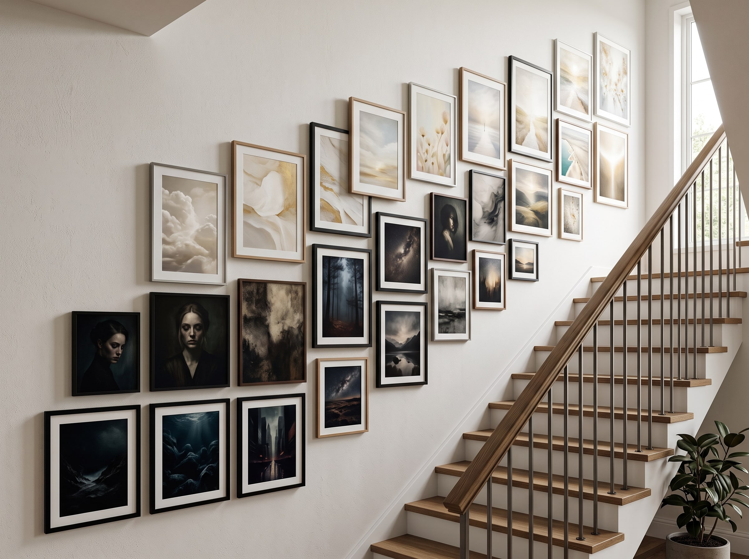
A stairway is one of the few places in a home where art can tell a literal story — a visual narrative that unfolds as you climb. The concept is simple and striking: arrange AI art so the bottom of the stairwell feels darker and heavier, and each step upward grows lighter and brighter, as though you are ascending toward daylight. Bottom frames might hold deep noir landscapes, rich botanicals in shadow, or moody abstracts in slate and indigo. Mid-stair pieces transition — softer landscapes, muted portraits, impressionist scenes in overcast light. Top frames burst with golden-hour warmth, pale watercolors, or airy abstracts in cream and blush.
Measure the wall beside your stair run and mark the vertical center of each tread — art hung at alternating heights following the staircase rhythm feels dynamic without chaos. Keep frames identical in finish (matte black unifies almost any progression) and sizes consistent within each "chapter" of the ascent. Generate all pieces in a related style family — all impressionist, all line art, all watercolor — so the tonal shift reads as intentional evolution, not random mismatches. Leave the art slightly higher on the wall than standard gallery height to account for the downward angle of viewers on the stairs. The atmosphere is movement and discovery: every trip upstairs becomes a small journey, and guests will comment on the progression before they reach the landing. It is one of the most memorable applications of AI art home decor — a sequence no store-bought print collection could replicate.
See It Before You Print: Browse the Pablo AI gallery for inspiration and preview how different styles look at scale. Generate a few variations of each concept, compare them against photos of your actual walls, and choose the piece that makes you want to redecorate everything else around it. Our how to create AI art guide covers the generation workflow from first prompt to final selection.
The difference between a house and a home often comes down to what hangs on the walls. AI art home decor gives you the freedom to experiment with wall art ideas that would be impossible to find in stores — pieces sized for your exact wall, colored for your exact sofa, styled for your exact mood. You do not need to redecorate an entire room overnight. Start with one wall, one frame, one idea from this list. Then watch how a single print changes the way every pillow, plant, and lamp in the room suddenly feels like it belongs.
When you are ready to go from inspiration to installation, our creative journeys guide you from prompt to print. Choose your style, generate your art, and order a physical piece on premium art paper — because the best AI poster ideas deserve to exist in the real world, on real walls, in the home you love.
Budget-Friendly AI Art Decor: How to Style Every Room Without Breaking the Bank
Gallery-quality home decoration does not require gallery prices — and AI art home decor is one of the most cost-effective ways to achieve a designer look on a real-world budget. A commissioned original painting can run from several hundred to several thousand dollars and take weeks to deliver. A mass-market print from a big-box store might cost less, but it will also appear in a thousand other living rooms. AI art occupies a sweet spot: fully custom, infinitely iterable, and printable at a fraction of the cost of commissioned work. The savings come not from compromising on beauty, but from eliminating the middlemen — no gallery markup, no artist commission queue, no settling for whatever happens to be in stock.
The smartest budget strategy is to start with one statement piece rather than attempting a whole-home makeover at once. Choose the anchor wall in the room you use most — the living room sofa wall, the bedroom headboard, the entryway — and invest your first print there. A single well-placed thirty by forty inch piece on premium paper transforms a room more dramatically than five small prints scattered randomly. Once that wall is done, you will see the room differently: colors you never noticed in your rug suddenly matter, throw pillows look either perfect or wrong, and the next decorating decision becomes obvious. Build outward from the statement piece, one wall at a time.
Picture ledges are the budget decorator's secret weapon. A single ledge mounted at eye level lets you rotate AI poster ideas without new nail holes, new frames, or new expense — swap a summer watercolor for an autumn landscape in seconds. Ledges cost a fraction of custom framing and give you flexibility that fixed hanging cannot match. For shelves, mantels, and bookcases, print smaller sizes (eight by ten or eleven by fourteen) and lean them against the wall or prop them on stands rather than framing every piece. A trio of unframed prints on a floating shelf creates a curated vignette that costs less than one large framed statement piece — ideal for kitchens, bathrooms, and office bookcases.
Cohesive collections stretch your budget further. Generate four to six pieces in a single creative session using the same style keywords and palette — a set of botanicals, a series of abstract color studies, a progression of landscapes in the same golden-hour light. Printing multiples from one session often costs less per piece than generating and printing one-offs in different styles, and the visual cohesion makes even modest sizes feel intentional. Use our AI art styles guide to pick a style family, then generate the full collection before ordering. When it is time to print, our digital art to physical prints guide helps you choose paper and size combinations that maximize impact per dollar — because the goal is not cheap art, but art that looks expensive without being expensive.
What size should AI art be for home decor?
For a statement piece above a sofa or bed, aim for a print that is roughly two-thirds the width of the furniture below — common sizes include 24×36 inches, 30×40 inches, or 36×48 inches for large walls. Gallery walls work best with a mix of 8×10, 11×14, and 16×20 inch frames. Always measure your wall and furniture before ordering, and use our art print journey to preview scale. See our full guide on digital art to physical prints for sizing workflows.
How high should I hang wall art?
The center of a single piece or the center of a gallery cluster should sit at approximately 57 to 60 inches from the floor — standard gallery height at eye level. When hanging above furniture, leave six to eight inches between the bottom of the frame and the top of the furniture. In dining rooms, raise art slightly higher (around 65 inches) so it clears seated guests' sight lines. On stairways, hang slightly above standard height to account for the downward viewing angle.
Can I order physical prints of AI-generated art?
Yes. Pablo AI lets you generate custom art and order gallery-quality physical prints shipped directly to your home. Choose from premium art paper and multiple sizes through our art print journey. Your AI poster ideas become real, frame-ready pieces — not just digital files on a screen. Read our printing guide for paper and finish recommendations by room.
How do I choose a frame for AI art home decor?
Match your frame to your room's existing finishes. Natural oak and walnut complement warm, organic interiors; matte black suits modern and industrial spaces; thin white or gold frames work well in bedrooms and formal dining areas. For gallery walls, use identical frames across all pieces for cohesion. When in doubt, a simple thin frame in a neutral finish lets the art — not the border — do the talking.
Will AI art match my existing interior design?
That is one of the biggest advantages of AI art home decor. When generating, specify your room's color palette, style keywords (Scandinavian, mid-century, bohemian), and mood. You can create pieces that pull colors from your rug, complement your furniture, or deliberately contrast for impact. Generate several variations and compare them against photos of your room before committing to a print. Our AI art styles guide and how to create AI art walk you through style and prompt choices for any interior.
Browse Creative Journeys — Pick a room, choose a style, and create wall art that is uniquely yours. Our journeys make it easy to go from idea to framed print in minutes.