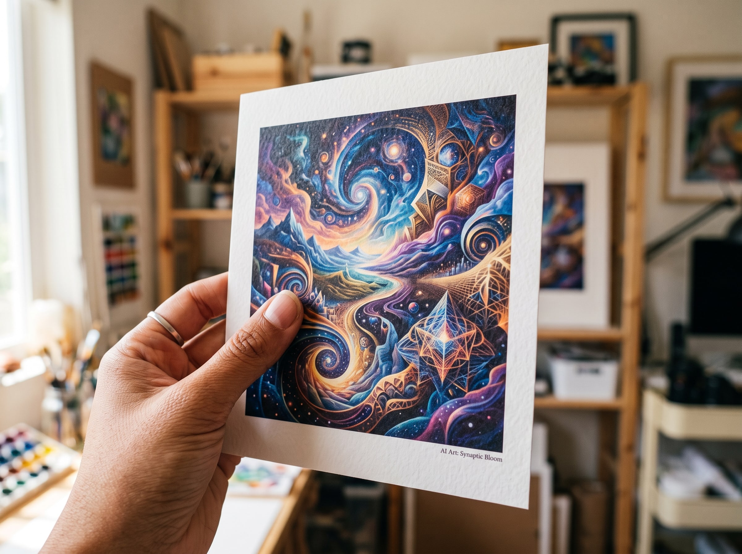
There is a moment that never gets old: opening a package and holding a print you created moments ago on a screen. The texture of the paper, the depth of the ink, the way light catches the surface — none of that translates through a monitor. At Pablo AI, we built our entire product around that moment. Custom prints are not an afterthought bolted onto an image generator. They are the destination. This post pulls back the curtain on our art printing process — how we go from pixels to a physical piece you are proud to display — because we think you deserve to know exactly what happens between "Generate" and the knock at your door. Whether you are ordering your first print or your fifteenth, understanding what happens behind the scenes helps you make better choices about paper, size, framing, and placement.
Why Physical Art Still Matters in a Digital Age
We live surrounded by screens. Phones, laptops, tablets, smart displays — digital images flicker past us by the thousands every day. AI art fits naturally into that world. You can generate a landscape, a portrait, an abstract composition in seconds and share it instantly. But something changes when art leaves the screen and enters your space. A physical print anchors a room. It creates a focal point on a blank wall, adds warmth to a home office, or turns a hallway into a personal gallery. Unlike a wallpaper file or a screensaver, a print does not disappear when you close a tab.
Physical art also carries emotional weight that digital files rarely match. A print of your pet, a landscape from a trip you never took but always dreamed about, a piece you created alongside someone you love — these become objects with presence. They are gifts that feel substantial. They are heirlooms in the making. For many of our customers, the decision to order AI art prints is less about decoration and more about making something intangible feel real. That is why we treat every step of the digital to physical art pipeline with the same care we put into the creative tools themselves. If you are still deciding what to create, our guide to AI art home decor ideas offers room-by-room inspiration for pieces worth printing.
There is also a practical dimension. Digital files get lost in camera rolls, buried in cloud storage, or trapped on devices that eventually get replaced. A print is a commitment — not in a burdensome way, but in the sense that you have chosen to give an image permanence. You have said this piece matters enough to occupy physical space in your life. That decision changes how you relate to the art itself. You notice details you skimmed past on a screen. You develop a relationship with the piece over months and years. That is the experience we are building toward from the moment you click Generate.
Art that lives on your wall does something no screen can — it waits for you. It is there when you wake up, when you sit down to work, when you come home at the end of the day. Physical art becomes part of the rhythm of your life. — Pablo AI Creative Team
How Pablo AI Generates Print-Ready, High-Resolution Images
A beautiful image on a phone screen is not automatically a beautiful print. Screen resolution and print resolution are fundamentally different beasts. Your monitor displays images at roughly 72 to 150 pixels per inch. A quality art print demands 300 DPI (dots per inch) at the final output size — meaning an 18×24 inch print needs an image that is 5,400 × 7,200 pixels. That is over 38 megapixels. Most raw AI outputs do not arrive at those dimensions out of the box, which is why our pipeline includes dedicated upscaling and enhancement stages before anything touches a printer.
When you finish a creative journey and select a piece for printing, our system evaluates the source image against the size you have chosen. We apply intelligent upscaling that preserves fine detail — brushstroke texture, gradient smoothness, edge sharpness — rather than simply stretching pixels. For pieces with intricate patterns or subtle color transitions, this step is the difference between a print that looks crisp at arm's length and one that reveals blocky artifacts when you step closer. We also run automated quality checks: highlight clipping, shadow crushing, and color banding are flagged before the file ever reaches our print partners.
Different art styles place different demands on resolution. A minimalist line drawing with large areas of flat color can often scale larger without visible degradation. A photorealistic portrait with fine hair detail or a complex abstract piece with layered textures needs more source information to survive enlargement. Our guide to the best AI art styles covers which styles translate most gracefully to print — useful context when you are generating with a specific wall size in mind. We recommend generating at the highest quality setting available and avoiding heavy cropping before sending to print, especially for formats 18×24 and larger.
Our quality threshold: Every image destined for print must pass our minimum resolution and color-depth requirements for the selected size. If a file cannot meet those standards — for example, if you choose an extremely large format from a small source — we surface that feedback before you checkout, not after your order ships. We would rather have an honest conversation about sizing than send you something we are not proud of.
Color space conversion is another behind-the-scenes step that matters enormously. AI models typically generate images in the sRGB color space, which is designed for screens. Professional printing uses CMYK or expanded gamut profiles depending on the printer and paper. Our system converts your artwork into a print-optimized profile while preserving the creative intent — the warmth of a sunset, the saturation of a floral piece, the muted tones of a minimalist composition. This conversion is where inexperienced print workflows often fail, producing washed-out or unexpectedly shifted colors. We have spent considerable time calibrating this stage against real-world print output, not just theoretical color models.
We also prepare files with appropriate sharpening for print output. Screen images benefit from different sharpening profiles than physical media — what looks crisp on a Retina display can appear over-sharpened on paper, and vice versa. Our processing applies print-specific sharpening that enhances edge definition without introducing halos or grain. Combined with our upscaling pipeline, this means the file that reaches the print lab is not simply a larger version of your screen image — it is a purpose-built reproduction file tuned for the specific paper and size you selected.
The Printing Technology and Materials We Trust
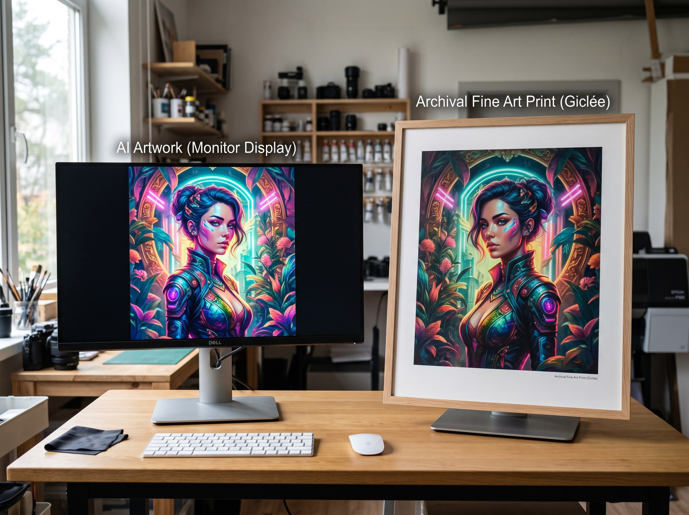
Pablo AI partners with professional fine-art print labs that specialize in giclée and pigment-based printing — not the kind of inkjet output you might get from a home office printer, and not the mass-produced poster printing you find at big-box stores. Giclée (pronounced zhee-klay, from the French word for "spray") refers to a specific method: archival pigment inks sprayed in microscopic droplets onto fine art paper or canvas using high-resolution inkjet printers. The result is a print with exceptional detail, smooth tonal gradations, and longevity measured in decades rather than years. When we say custom prints, we mean prints produced on the same equipment and with the same materials that galleries and photographers rely on.
Understanding the difference between giclée and standard digital printing matters because the terminology gets used loosely. A drugstore photo print, an office inkjet output, and a gallery giclée may all technically involve "digital printing," but they are not equivalent. Standard digital printing typically uses dye-based inks on coated photo paper. Dye inks sit on the surface of the paper and are more vulnerable to fading, moisture, and ozone exposure. Colors can shift within a few years under normal display conditions. Giclée printing uses pigment-based inks — microscopic particles of color suspended in a carrier liquid that bond with the paper fibers rather than sitting on top. Pigment prints resist fading for 60 to 100+ years under proper indoor display, which is why museums and collectors specify giclée for reproductions they expect to last generations.
Ink types and why they matter
Professional art printers use expanded ink sets beyond the standard CMYK four-color process. A typical giclée printer deploys eight to twelve ink colors: cyan, magenta, yellow, and black, plus light cyan, light magenta, light black (gray), and sometimes orange, green, or violet. These additional inks allow the printer to reproduce a wider color gamut and smoother gradients, particularly in skin tones, sky blues, and shadow areas where four-color printing would produce visible banding or muddy transitions. For AI art — which often features vivid, saturated palettes and smooth gradient backgrounds — this expanded ink set is not a luxury. It is what separates a print that looks flat and poster-like from one with the depth and nuance you see on screen.
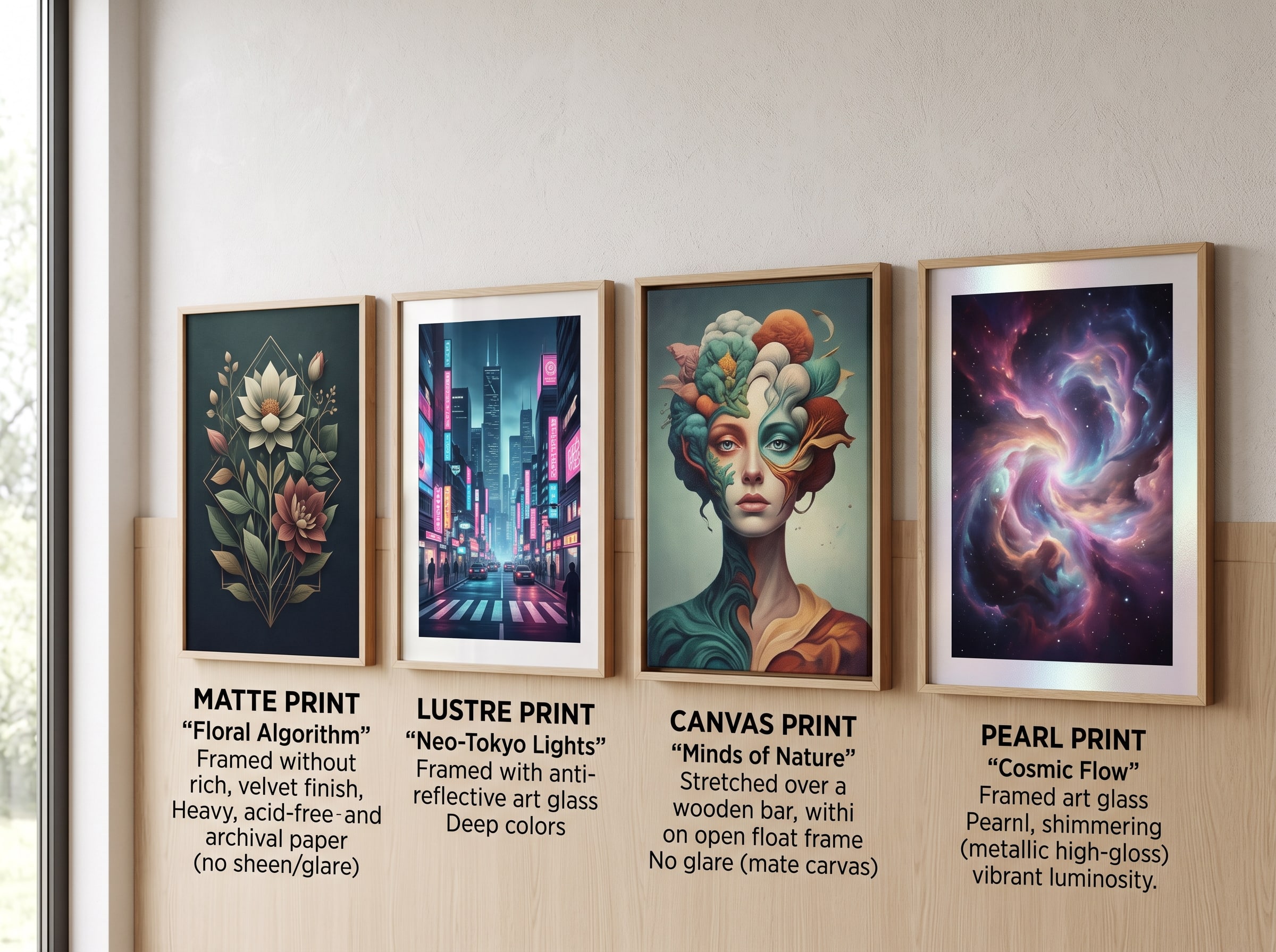
Pigment inks also behave differently on different paper surfaces. On a matte fine-art paper, ink absorbs slightly into the fiber, producing a soft, painterly quality. On a lustre or pearl surface, ink sits closer to the surface, yielding sharper detail and more vivid color saturation. Our print partners maintain custom ICC profiles for each paper-and-ink combination, so the printer knows exactly how much of each ink color to lay down for accurate reproduction. This level of calibration is simply not available in consumer-grade printing — another reason we partner with dedicated fine-art labs rather than generic print-on-demand services.
Our print partners operate commercial-grade printers from manufacturers like Epson and Canon in their large-format lines, calibrated specifically for art reproduction. These machines handle sheets and rolls up to 44 inches wide, giving us the flexibility to offer a range of sizes without compromising quality. Pigment inks are lightfast and water-resistant, which means your print will resist fading under normal indoor lighting conditions far better than dye-based alternatives. We selected partners who share our quality standards and who print on demand — meaning your piece is produced individually when you order it, not pulled from a warehouse of pre-made stock.
What happens at the print lab
Once your print-ready file arrives at the lab, it enters a workflow that mirrors professional fine-art production. The file is loaded into RIP (Raster Image Processing) software that communicates directly with the printer, optimizing ink laydown for the specific paper profile. A test strip may be printed to verify color alignment. Then the full print run — typically a single sheet for your order — begins. Each pass of the print head deposits layers of cyan, magenta, yellow, black, and often additional colors like light cyan, light magenta, and gray, building the image with precision that human eyes can appreciate up close.
The RIP software also handles dithering — the process of simulating continuous tones using patterns of ink dots. Fine-art RIP engines use stochastic dithering algorithms that produce smoother gradients and less visible dot patterns than the halftone screens used in commercial offset printing. For AI art with large areas of subtle color transition — think atmospheric landscapes, soft bokeh backgrounds, or minimalist gradient compositions — this dithering quality directly affects how smooth the finished print appears. It is one of those technical details that separates professional output from amateur results, even when the source file is identical.
Giclée vs. standard digital printing at a glance: Standard digital prints use dye inks on photo paper, fade within years, and suit snapshots and temporary displays. Giclée prints use pigment inks on archival fine-art paper or canvas, last 60–100+ years indoors, and suit artwork you intend to frame and keep. Pablo AI prints exclusively through the giclée process.
Paper Types, Sizes, and What They Mean for Your Art
Paper is not a neutral carrier — it is an active participant in how your art looks and feels. The same image printed on a glossy surface versus a matte fine-art paper will appear distinctly different in contrast, saturation, and texture. At Pablo AI, we offer curated paper options through our Art Paper collection, each selected for how it complements AI-generated artwork across styles from photorealistic to abstract. Choosing the right paper is one of the most impactful decisions you can make, and we have designed our product pages to help you understand those differences rather than hiding them behind jargon.
Weight and thickness matter too. Fine-art papers typically range from 200 to 310 gsm (grams per square meter). Heavier papers feel more substantial in hand, resist curling, and handle framing better — especially in larger formats where a thin paper might sag or ripple inside a frame. Our matte and lustre options use papers in the 250–310 gsm range, which is the standard for museum-quality reproduction. Canvas is stretched on wooden bars for gallery-wrap presentation, with a texture that adds a painterly dimension to AI art in styles like impressionism, abstract expressionism, or digital oil painting.
| Paper Type | Finish & Feel | Best For | Available Sizes |
|---|---|---|---|
| Matte Fine Art | Smooth, non-reflective surface with a subtle texture | Portraits, soft landscapes, minimalist and abstract pieces | 8×10", 11×14", 16×20", 18×24", 24×36" |
| Lustre | Semi-gloss with a slight sheen; resists fingerprints | Vibrant colors, photorealistic AI art, detailed illustrations | 8×10", 11×14", 16×20", 18×24", 24×36" |
| Canvas | Woven texture with a gallery-wrap ready surface | Bold compositions, painterly styles, statement pieces | 12×16", 16×20", 20×30", 24×36" |
| Pearl | Subtle metallic shimmer that adds depth to highlights | Dramatic lighting, fantasy art, high-contrast designs | 8×10", 11×14", 16×20", 18×24" |
Size selection is equally important. Larger prints showcase detail and make a bold statement, but they also demand higher source resolution — which is why our system validates your choices at checkout. Smaller sizes like 8×10 or 11×14 are wonderful for desks, shelves, and gallery walls with multiple pieces. Medium formats like 16×20 and 18×24 suit living rooms and bedrooms as standalone focal points. Large formats like 24×36 transform a wall and work beautifully above sofas or in entryways. Browse our full range of custom print products to see current offerings and sizing options.
Consider the viewing distance when choosing size. A piece hung above a sofa will typically be viewed from six to ten feet away, where larger formats and bolder compositions shine. A print on a desk or bookshelf is viewed from much closer, where smaller sizes and fine detail become more important. Matching size to viewing context is one of the most common mistakes in home art display — and one of the easiest to avoid with a little planning. Our home decor ideas guide includes specific size and placement recommendations for every room in your home.
Not sure which paper to choose?: If you are gifting a print or decorating a space with mixed lighting, matte fine art is our most forgiving and universally flattering option. For pieces with rich colors and fine detail you want to pop, lustre is a reliable favorite. When in doubt, the paper descriptions on our Art Paper page include visual examples and style recommendations.
Framing Your AI Art: A Complete Guide
A great print deserves a great frame. Framing is the final step in the digital-to-physical journey, and it has an outsized impact on how your art looks and how long it lasts. The right frame protects your print, complements your decor, and elevates AI art from "something I printed" to "something that belongs on my wall." The wrong frame — or no frame at all in a high-traffic area — can undermine even the best print. Here is what we have learned from thousands of customer orders and our own display testing.
Frame materials: wood, metal, and acrylic
Wood frames are the classic choice for fine-art prints. Natural wood — oak, walnut, ash, maple — adds warmth and works across virtually every interior style, from traditional to modern. Painted wood frames in black, white, or custom colors offer a cleaner, more contemporary look. Wood frames typically include a rabbet (the recessed edge that holds the print, mat, and backing) and come in profiles ranging from thin and minimal to wide and ornate. For AI art, we find that simple profiles in natural or matte black finishes let the artwork remain the focal point without competing for attention.
Metal frames — usually aluminum in thin, sleek profiles — suit modern, minimalist, and industrial interiors. They are lightweight, durable, and available in brushed silver, matte black, gold, and white finishes. Metal frames work particularly well with abstract AI art, geometric compositions, and high-contrast pieces. Acrylic frames (sometimes called "frameless" or "floating" frames) sandwich the print between two sheets of clear acrylic, creating a contemporary gallery look where the art appears to float on the wall. Acrylic frames are excellent for smaller prints, desk display, and spaces where you want the art itself — not the frame — to dominate.
Matting: yes, no, or somewhere in between
Matting — the border of acid-free board between the print and the frame — serves both aesthetic and practical purposes. A mat creates visual breathing room around the artwork, preventing the image from feeling cramped inside the frame. It also keeps the print surface from contacting the glass or acrylic glazing, which is critical for long-term preservation. Without a mat, condensation can form between the print and glazing over time, leading to sticking, mold, and irreversible damage.
Standard mat widths range from two to four inches per side, with wider mats creating a more formal, gallery-like presentation. White and off-white mats are the most versatile and suit the widest range of artwork. Colored mats — gray, black, or tones pulled from the artwork itself — can create dramatic effects but require more careful coordination. For AI art with full-bleed compositions that extend to the edges, a mat may not be necessary or desirable. For portraits, detailed illustrations, and pieces with important content near the edges, we generally recommend matting. A good rule of thumb: if the print has a white border or margin built in, skip the mat; if the image runs edge to edge, add one.
Frame color and room coordination
Frame color should complement both the artwork and the room, not match everything perfectly. Matching your frame to your furniture finish creates a cohesive look but can also make the art feel like an afterthought rather than a statement. We recommend choosing a frame color that picks up one accent tone from the artwork — a warm wood frame for a landscape with golden tones, a black frame for a high-contrast abstract — while letting the art itself supply the color energy in the room. In rooms with mixed frame styles (gallery walls, eclectic decor), a consistent frame finish across all pieces creates unity even when the artwork varies widely in style and color.
Consider your wall color too. A white mat in a white frame on a white wall can make art feel lost. Adding a thin black frame or a wider mat creates definition. Conversely, a dark frame on a dark wall needs sufficient mat width or surrounding space to avoid a swallowed, flat appearance. When in doubt, black frames are the most forgiving universal choice — they work with virtually any artwork and any wall color.
The museum glass question
Standard picture framing glass protects against dust and physical damage but reflects light, which can make art difficult to view depending on room lighting. Non-glare (matte) glass reduces reflections but diffuses the image slightly, softening fine detail — a trade-off that matters for detailed AI art. Museum glass — also called conservation or UV-filtering glass — offers the best of all worlds: near-invisible reflections, 99% UV protection, and no image diffusion. It is significantly more expensive than standard glass, but for prints in sunny rooms or pieces you expect to display for decades, it is a worthwhile investment.
Acrylic glazing is a lighter, shatter-resistant alternative to glass, available in standard, non-glare, and UV-filtering versions. It scratches more easily than glass but is the safer choice for frames in high-traffic areas, children's rooms, or anywhere a fall is possible. For most indoor display situations with controlled lighting, standard glass or acrylic is perfectly adequate. Reserve museum glass for pieces in direct or strong indirect sunlight, or for prints with significant personal or monetary value.
| Frame Type | Pros | Cons | Best Uses |
|---|---|---|---|
| Natural Wood | Warm, timeless, suits most interiors and art styles | Can feel traditional; quality varies widely by price | Landscapes, portraits, warm-toned abstract art, living rooms |
| Black Metal | Sleek, modern, creates strong visual definition | Can feel cold in warm-toned rooms; limited profile options | Abstract art, geometric pieces, gallery walls, offices |
| Acrylic (Floating) | Contemporary, lightweight, art appears to float on wall | Scratches easily; can look informal in formal spaces | Small to medium prints, desk display, modern interiors |
| White Wood/Painted | Clean, bright, complements light interiors and minimal art | Shows dirt and scuffs; can compete with light-colored art | Line art, minimalist compositions, Scandinavian interiors |
| Ornate/Gilded | Formal, luxurious, adds gravitas to statement pieces | Overwhelms most AI art; expensive; suits specific decor only | Classical-style AI art, formal dining rooms, traditional homes |
DIY framing vs. professional framing
Ready-made frames from home stores are a practical and affordable option for standard sizes like 8×10, 11×14, and 16×20. Look for frames labeled "acid-free" that include a mat and backing board. Avoid frames with no mat or backing — they offer minimal protection. For Pablo AI print sizes, verify the frame's inner dimensions match your print size or plan to add a mat that accounts for the difference. Many ready-made frames are sized for standard photo prints, which may not match fine-art paper dimensions exactly.
Professional framing — through a local frame shop or online custom framing service — is worth the investment for oversized prints, irreplaceable personal pieces, and any artwork you plan to display for years. A professional framer will recommend appropriate mat widths, glazing options, and mounting methods (hinging with archival tape rather than dry-mounting, which is permanent and can damage prints). Expect to pay two to five times the cost of a ready-made frame, but the result is tailored to your specific print and space. For a 24×36 statement piece above your sofa, professional framing is the difference between "nice print" and "gallery installation."
Color Accuracy and Calibration — Getting It Right
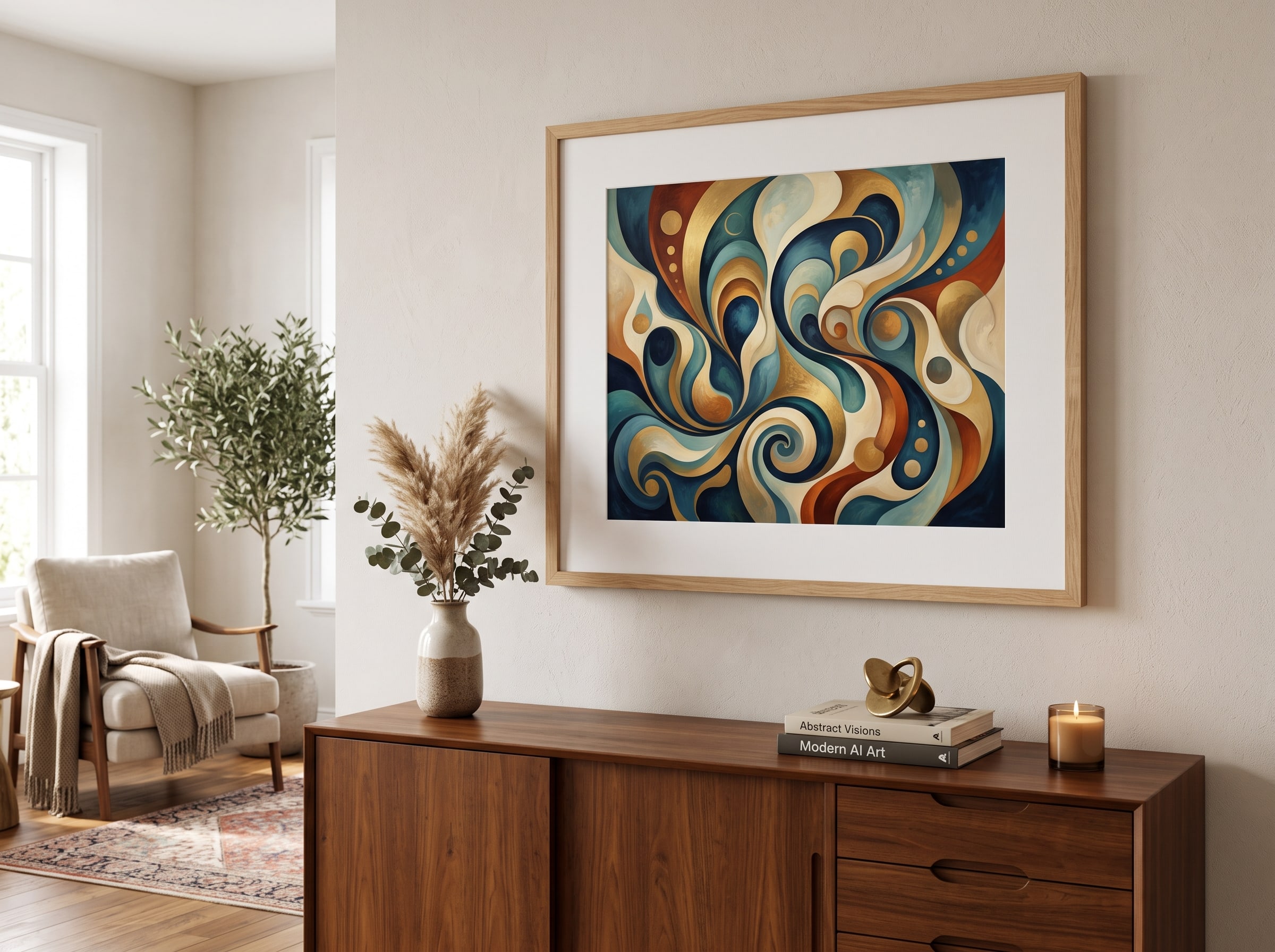
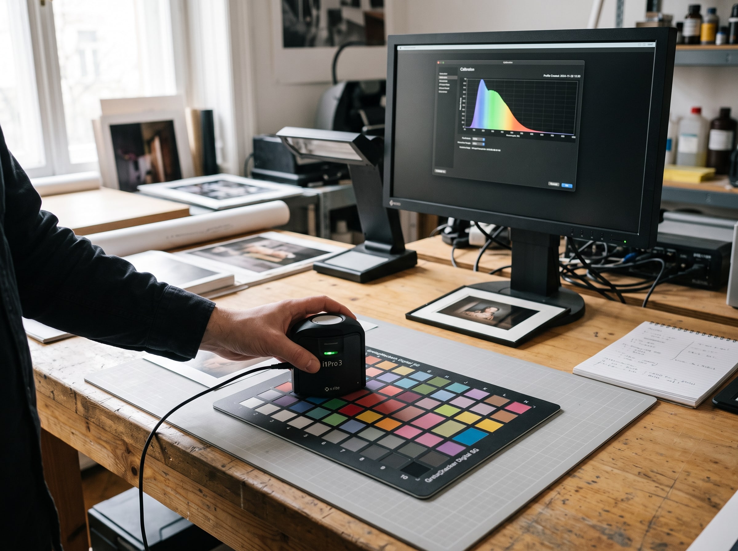
Color is subjective, but color management is a science. The biggest challenge in the digital to physical art transition is that no two viewing environments are identical. The warm LED bulbs in your living room, the cool daylight from a north-facing window, even the color of your walls — all of these influence how you perceive a print. What we can control is consistency between what we intend to print and what comes off the press. That requires a disciplined calibration workflow at every stage of our pipeline.
Our monitors and soft-proofing environments at Pablo AI are calibrated to industry-standard D50 viewing conditions using hardware colorimeters. Print partners maintain their own calibration schedules — typically weekly or biweekly — using standardized test targets and spectrophotometer readings. Each paper type has a unique ICC profile that tells the printer exactly how ink will behave on that surface. When your file is processed, it is tagged with the correct profile for your chosen paper, ensuring the conversion from sRGB to print color space is accurate for that specific combination of ink and material.
We also account for something called "optical brightening agents" — chemicals in some papers that make them appear whiter under UV light. OBAs can shift how colors render, especially in warm tones and skin tones. Our paper selections are chosen partly for their OBA characteristics, and our profiles compensate accordingly. The result is that a portrait with delicate skin tones or a sunset with subtle orange gradients arrives looking the way our creative team expects — not unexpectedly cool or oversaturated. We will never claim that a screen preview is a perfect predictor of a physical print, but we work hard to close that gap.
There are colors that screens can display but printers cannot reproduce — particularly neon greens, electric blues, and deeply saturated magentas. AI models sometimes generate colors at the edge of or beyond the printable gamut. Our processing identifies out-of-gamut colors and maps them to the nearest reproducible equivalent, preserving the overall feel of the piece rather than clipping to dull approximations. This is a subtle but important step that prevents the "why does my print look different?" disappointment that plagues less careful print workflows. If your art uses extremely vivid, fluorescent palettes — common in fantasy and pop art styles from our best AI art styles guide — expect the print to be slightly less electric than the screen, but still rich and vibrant.
How to Hang Your Art: Placement, Height, and Lighting
A perfectly printed, beautifully framed piece can still look wrong if it is hung poorly. Placement, height, and lighting are the three variables that most people get wrong — and the three that make the biggest difference between art that looks professional and art that looks like an afterthought. Here is what we recommend based on gallery standards and interior design best practices.
The 57-inch rule and furniture proportions
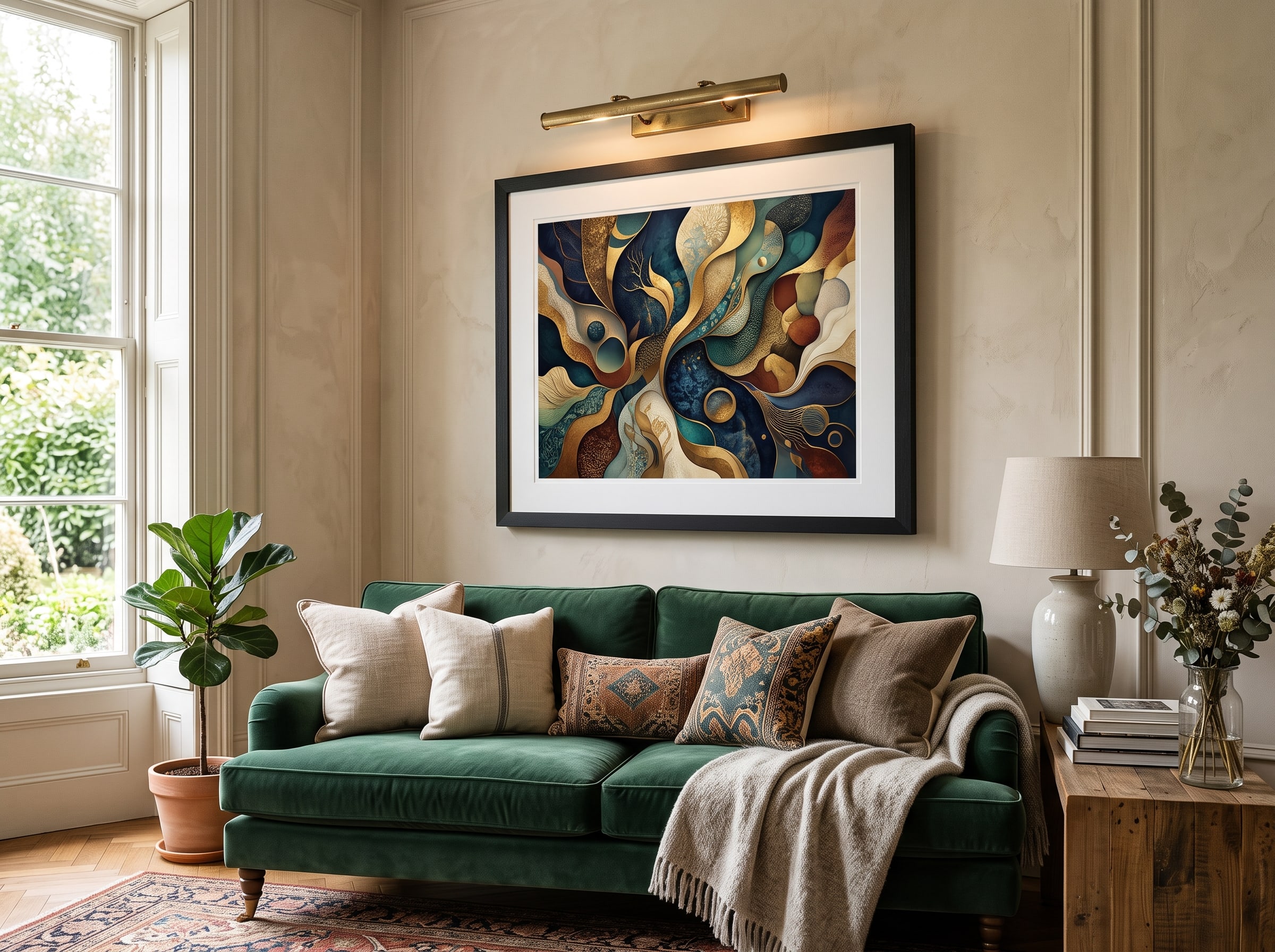
Museums hang art so the center of the piece sits at approximately 57 to 60 inches from the floor — roughly average eye level for a standing adult. This is the single most reliable guideline for hanging height in residential spaces. When hanging above furniture, the bottom edge of the frame should sit six to ten inches above the furniture top. For a standard sofa, that typically places the center of a medium-sized piece around 57 inches, but always measure rather than assume.
Width matters as much as height. A piece above a sofa should span roughly two-thirds the width of the furniture — wide enough to feel intentional, not so wide that it overwhelms. For a 84-inch sofa, aim for artwork (or a group of frames) totaling roughly 56 inches wide. A single print that is too narrow looks lost; one that is too wide feels top-heavy. The same proportional logic applies above beds, consoles, and mantels. When in doubt, err slightly larger rather than smaller — a common mistake is hanging art that is too small for the wall and furniture below it.
Gallery wall spacing formulas
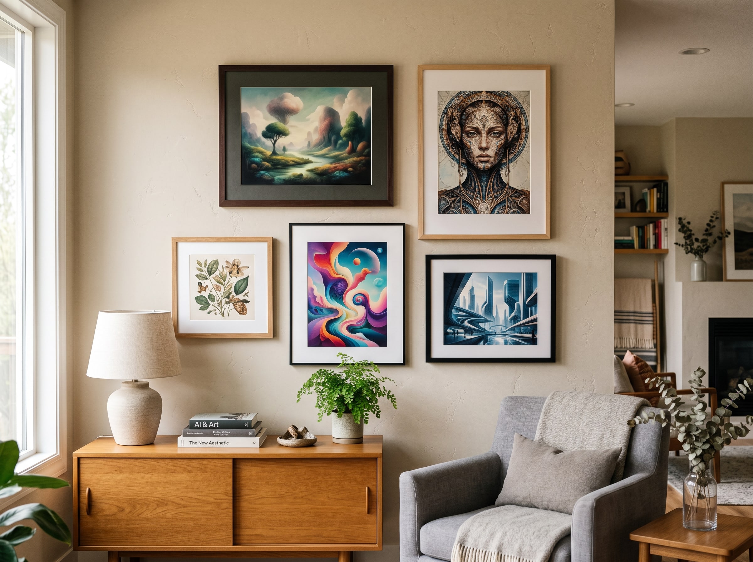
Gallery walls — arrangements of multiple pieces — require consistent spacing to look intentional. The standard formula: maintain two to three inches between frame edges, both horizontally and vertically. Use paper templates cut to each frame size and tape them to the wall before committing to nail holes. Start with the largest piece at center eye level and build outward. For a symmetrical grid, mark a baseline and use a level to ensure the bottom edges of frames in the same row align perfectly.
Mixed-size gallery walls benefit from a unifying element: identical frame finishes, a consistent mat color, or a shared color palette across the artwork itself. AI art makes this easy — you can generate a series of pieces in the same style with coordinated colors, then print them in matching sizes and frames. Our home decor guide includes several gallery wall concepts with specific size and spacing recommendations.
Lighting your art
Picture lights — mounted above or below the frame — add drama and visibility, especially for art in dimly lit rooms or on walls without natural light. LED picture lights with adjustable color temperature (2700K to 3000K for warm tones) are the current standard. Avoid halogen picture lights, which produce significant UV and heat that accelerate fading. Track lighting with adjustable heads is a flexible alternative for rooms with multiple pieces. Position lights at a 30-degree angle to the artwork to minimize glare on glazed frames.
Natural light is the most flattering illumination for art, but direct sunlight is its greatest enemy. Even with museum glass and archival pigment inks, prolonged direct sun will fade any print over time. Hang art on walls that receive indirect or filtered light. North-facing walls provide consistent, cool illumination without direct sun — ideal for color-critical pieces. If you must hang on a south- or west-facing wall, consider UV-filtering window film or motorized shades that protect art during peak sun hours.
- Gather your tools: a pencil, level, measuring tape, hammer, and appropriate hanging hardware for your wall type (drywall, plaster, or brick).
- Measure and mark the center point of your desired hanging location at 57 inches from the floor (adjust for furniture below).
- For pieces above furniture, confirm the bottom of the frame will sit six to ten inches above the furniture top.
- Select hanging hardware rated for at least twice the weight of your framed piece. Use two hooks for frames wider than 24 inches to prevent tilting.
- Mark hook positions on the wall using the frame's wire or D-ring placement as a guide — measure the distance from the top of the frame to the hanging point and transfer to the wall.
- Install hooks or anchors, checking level before final placement. For heavy frames, use stud finders and screw directly into wall studs when possible.
- Hang the frame and step back to assess. Adjust height or hook position if the piece looks off-center or too high/low relative to surrounding furniture.
- If using picture lighting, mount the fixture and adjust the beam angle to illuminate the art evenly without creating hot spots or glare.
Picture hanging hardware matters: Never use adhesive strips or small wire hooks for framed fine-art prints — especially in larger sizes. A 16×20 framed print with glass can weigh five to eight pounds; a 24×36 framed piece can exceed fifteen pounds. Use wall anchors rated for the weight, and for anything over ten pounds, mount into a wall stud. Two D-rings screwed into the frame back (rather than a single centered wire) provide the most stable, level hanging for medium and large pieces.
From Studio to Your Doorstep: Packaging and Shipping
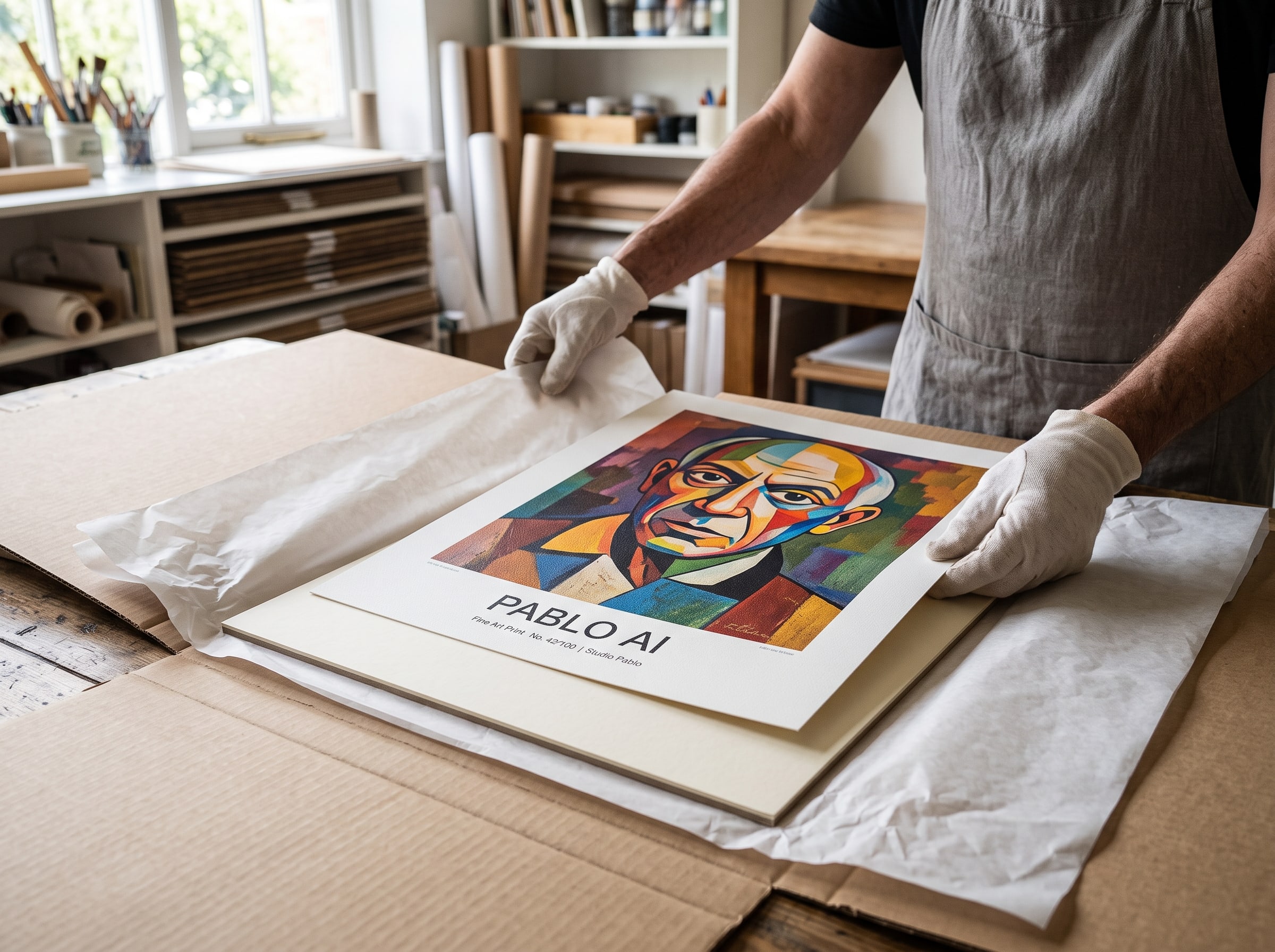
A perfectly printed piece deserves to arrive in perfect condition. After printing, each piece is inspected for defects — dust spots, banding, color inconsistencies, edge damage — before it passes quality control. Prints are allowed to cure for an appropriate period so the ink fully sets before handling. Then they are packaged using materials designed specifically for flat art: rigid mailers or tubes with crumple zones, acid-free tissue or glassine interleaving, and corner protectors for larger flat formats. We would rather spend an extra dollar on packaging than risk a crease across the face of your artwork.
Flat packaging is our default for fine-art paper prints. The print is placed face-up on a rigid backing board, covered with acid-free tissue, and secured inside a crush-resistant flat mailer with corner protectors. This method keeps the print perfectly flat and protected from bending — the most common cause of damage in art shipping. Canvas prints and very large formats may ship in reinforced tubes, rolled with the image facing outward and protected by interleaving paper. Rolled prints should be unrolled and laid flat (or framed) within a few days of arrival to prevent permanent curling.
Shipping timelines and tracking are handled through our shipping partners and policies, which vary by destination and order size. Domestic orders typically arrive within five to ten business days after production. International orders take longer but follow the same quality standards in production and packaging. You receive tracking information as soon as your order ships, and our support team is available if anything goes wrong in transit — which is rare, but we stand behind every shipment.
The journey from digital to doorstep
- You create and refine your artwork using Pablo AI's generation tools, selecting a piece you love from your creative journey.
- You choose your print size, paper type, and quantity — our system validates resolution and flags any sizing concerns before checkout.
- Your print-ready file is processed: upscaled, color-converted, and tagged with the correct ICC profile for your paper selection.
- The file is transmitted to our print partner, where it is RIP-processed and printed on professional giclée equipment using archival pigment inks.
- The finished print is inspected, cured, and carefully packaged in art-safe materials to protect it during transit.
- Your order ships with tracking via our shipping network, and your custom print arrives ready to frame, hang, or gift.
Caring for Your Prints: Longevity and Preservation
A giclée print on archival paper with pigment inks is built to last decades — but "archival" is not the same as "indestructible." How you display, handle, and store your print determines whether it looks vibrant in ten years or faded and damaged in three. The good news: caring for fine-art prints is straightforward once you know the basics. Most of what follows applies equally to AI art prints and any other giclée reproduction.
UV protection and light exposure
Ultraviolet light is the primary enemy of print longevity. Even with archival pigment inks, cumulative UV exposure causes gradual fading — first in the most vulnerable colors (reds and yellows), then across the full image. Direct sunlight can noticeably fade a print within months. Strong indirect sunlight over years produces the same effect more slowly. Display prints away from windows, use UV-filtering glass or acrylic when framing, and consider window film in rooms with significant sun exposure. LED and incandescent bulbs produce minimal UV and are safe for art at normal illumination levels.
Humidity and environmental conditions
Ideal conditions for fine-art prints are roughly 40–60% relative humidity and temperatures between 65–75°F (18–24°C). High humidity promotes mold growth, paper warping, and ink bleeding — particularly in unframed prints or frames without proper sealing. Very low humidity makes paper brittle and can cause cracking in canvas. Bathrooms, unventilated basements, and areas near HVAC vents are poor display locations. If you live in a humid climate, ensure framed prints are properly sealed with backing paper and consider silica gel packets in frame backs for added protection.
Cleaning and handling
Dust framed prints gently with a soft, dry microfiber cloth — never spray cleaning products directly on or near the print. For glazed frames, clean the glass or acrylic with a mild glass cleaner applied to the cloth, not the frame. Never touch the surface of an unframed or unglazed print with bare fingers — skin oils leave marks that are difficult to remove. When handling unframed prints, hold by opposite corners with clean, dry hands or wear cotton gloves. If a print accumulates dust without glazing, use a soft brush (like a clean makeup brush) to gently sweep the surface.
When to replace or reprint
With proper care, a giclée print should not need replacement for decades. Consider reprinting if you notice significant fading (usually from UV exposure), physical damage (tears, creases, water stains), or if you want a larger size after upgrading your space. One advantage of AI art: your original generation file is preserved in your Pablo AI account, so reprinting is straightforward — often with improved upscaling as our processing pipeline evolves. Keep your creative journey intact and you always have the option to print again.
Storing unframed prints
If you are not framing immediately, store prints flat — never rolled long-term, which can cause permanent curl and cracking. Place the print in an acid-free sleeve or interleave it with acid-free tissue paper. Store flat in a drawer, portfolio, or box, away from direct light, heat sources, and moisture. Do not stack heavy objects on top. If you must store multiple prints together, interleave each with tissue to prevent surface abrasion. Never store prints in attics, garages, or basements where temperature and humidity fluctuate dramatically.
- Do display away from direct sunlight and strong UV sources.
- Do use UV-filtering glass or acrylic for frames in bright rooms.
- Do maintain stable humidity (40–60%) and moderate temperatures.
- Do handle prints with clean hands or cotton gloves.
- Do store unframed prints flat in acid-free sleeves with tissue interleaving.
- Do dust framed prints gently with a soft microfiber cloth.
- Do use acid-free mats and backing boards when framing.
- Don't hang prints in bathrooms, unventilated basements, or near heat vents.
- Don't touch the print surface with bare fingers.
- Don't use adhesive tape directly on the print — use archival hinging tape on the back edge only.
- Don't store prints rolled long-term or in areas with extreme temperature swings.
- Don't spray cleaning products on or near the print surface.
- Don't dry-mount or permanently adhere prints to backing boards — this is irreversible and damages value.
- Don't ignore early signs of fading — relocate the print before damage becomes severe.
Sustainability in the Print Pipeline
Physical products carry environmental costs, and we do not pretend otherwise. Printing requires paper, ink, energy, and shipping fuel. Our approach to sustainability is pragmatic: reduce waste where we can, choose responsible materials where they exist, and produce on demand so we never manufacture prints that nobody asked for. Every Pablo AI print is made when you order it. There is no inventory of unsold stock sitting in a warehouse, no overproduction cycle, and no disposal of prints that never found a home.
On-demand production eliminates one of the print industry's largest waste streams: overstock. Traditional retail printing often produces thousands of copies anticipating demand, then pulps or landfills what does not sell. Our model inverts that entirely. When you order an 18×24 matte print, one 18×24 matte print is produced. No surplus. No warehouse energy consumption for stored inventory. No disposal of outdated stock when designs change. This is not a marketing claim — it is the structural reality of how our fulfillment pipeline works.
Our paper suppliers include options with recycled content and certifications from organizations like the Forest Stewardship Council (FSC) where available. FSC-certified papers come from forests managed to strict environmental and social standards — responsible harvesting, habitat protection, and community rights. Where recycled-content fine-art papers meet our quality standards for giclée printing, we offer them. Where they do not yet meet the color fidelity and longevity we require, we are transparent about that trade-off rather than compromising print quality for a label.
Pigment-based giclée inks are generally more environmentally stable than dye-based alternatives — they produce less waste during production and do not require the same chemical-intensive processing. Epson and Canon, whose printers our partners use, have made significant progress in reducing ink cartridge waste through refillable bulk ink systems in their commercial lines. A large-format printer with bulk ink reservoirs generates a fraction of the plastic waste compared to cartridge-based consumer printers. Packaging materials are selected for recyclability: corrugated cardboard mailers, paper-based corner protectors, and kraft tissue interleaving. We use plastic sleeve protection only when necessary to shield a print from moisture during transit — and we are actively testing biodegradable alternatives.
Shipping routes are optimized through our fulfillment partners to reduce unnecessary transit legs. Where possible, prints are produced at facilities geographically close to the delivery destination, reducing cross-country shipping for domestic orders. International orders require longer routes — we acknowledge that — but the same on-demand, no-overstock model applies regardless of destination. Carbon-neutral shipping options are on our roadmap as carrier programs mature and become available at scale.
We are not perfect, and we are honest about that. The most sustainable print is one you love enough to keep for years — which loops back to everything we have discussed in this post. Quality is sustainability. A print that fades, creases in cheap packaging, or arrives with disappointing color gets replaced, returned, or discarded. A print you hang proudly and keep for a decade requires no replacement. That is why we invest in the entire pipeline, not just the generation step. Making AI art prints that last is the most meaningful environmental choice we can make.
Will my print look exactly like what I see on my screen?
Screen previews are a close approximation, but they cannot be pixel-perfect matches to a physical print. Monitors vary in brightness, color temperature, and calibration. We soft-proof every file against the ICC profile for your chosen paper, and our print partners calibrate their equipment regularly. Most customers find the print matches or exceeds their expectations, especially in color richness and detail. Extremely vivid neon colors may appear slightly less saturated on paper than on screen — this is a limitation of all printing, not specific to AI art. If you are ever unsatisfied with the quality of your print, contact our support team — we stand behind our work.
What paper do you recommend for AI art prints?
It depends on your artwork and where you plan to display it. Matte fine art paper is our most versatile option — it handles a wide range of styles and looks excellent under varied lighting. Lustre is ideal for vibrant, detailed pieces where you want colors to pop with a subtle sheen. Canvas works beautifully for bold, painterly compositions. Pearl adds a luminous quality to highlights and suits dramatic, high-contrast art. Visit our Art Paper page for detailed descriptions and visual examples, or see our guide to the best AI art styles for style-specific paper recommendations.
How long will my print last before fading?
Our giclée prints use archival pigment inks on acid-free, fine-art papers. Under normal indoor display conditions — away from direct sunlight and high humidity — you can expect your print to remain vibrant for 60 to 100+ years. Fading accelerates with prolonged UV exposure, so we recommend avoiding placement in direct sun and using UV-filtering glass for bright rooms. Canvas and lustre prints share similar longevity when displayed and cared for properly.
Can I order large-format prints without losing quality?
Yes, within the limits of your source image. Our upscaling pipeline is designed to support large formats, and we validate resolution at checkout for every size you select. If your source image cannot support a particular size without quality loss, we will let you know before you complete your order. For best results at 24×36 and larger, start with high-detail generations and avoid excessive cropping before sending to print.
Do you use sustainable or recycled materials?
We prioritize on-demand production to eliminate overstock waste, and we offer paper options with recycled content and FSC certification where available. Our packaging uses recyclable cardboard and paper-based cushioning, with plastic used only when necessary for moisture protection during shipping. Our print partners use bulk ink systems that reduce plastic cartridge waste. We continue to evaluate our supply chain for improvements as better materials and processes become available.
Should I frame my print before hanging it?
We strongly recommend framing for any print you plan to display long-term. Framing protects against dust, moisture, physical damage, and UV exposure. A mat keeps the print surface from contacting glazing, preventing sticking and mold. Ready-made frames work well for standard sizes; professional framing is worth the investment for oversized pieces and irreplaceable personal art. See the framing section above for detailed guidance on materials, matting, and glazing options.
Shop Custom Prints — Browse our custom print collection, choose your paper and size, and hold your creation in your hands within days — not someday.